Redesign the GBR branding!
Redesign the GBR branding!
The Issue
Overview:
Recently the UK Government have introduced the brand identity for the new publicly owned railway ‘Great British Railways’. Although it is amazing to see our railways put back into public ownership, the branding doesn’t do it justice and I’m proposing a redesign to rectify some of these issues. And you can help too!
The current brand identity:
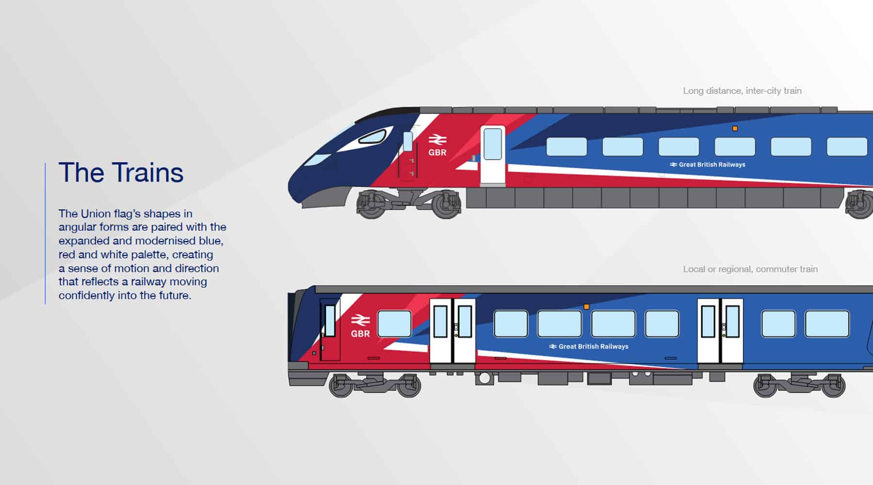
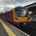
The current design looks tacky, poorly designed and gives off a sense of forced patriotism rather than national pride for our country’s railways. It doesn’t complement any train that wears it and certainly isn’t appealing to look at. However, I do not mean any personal offence to the designer, you were just doing your job.
My brand identity proposal:
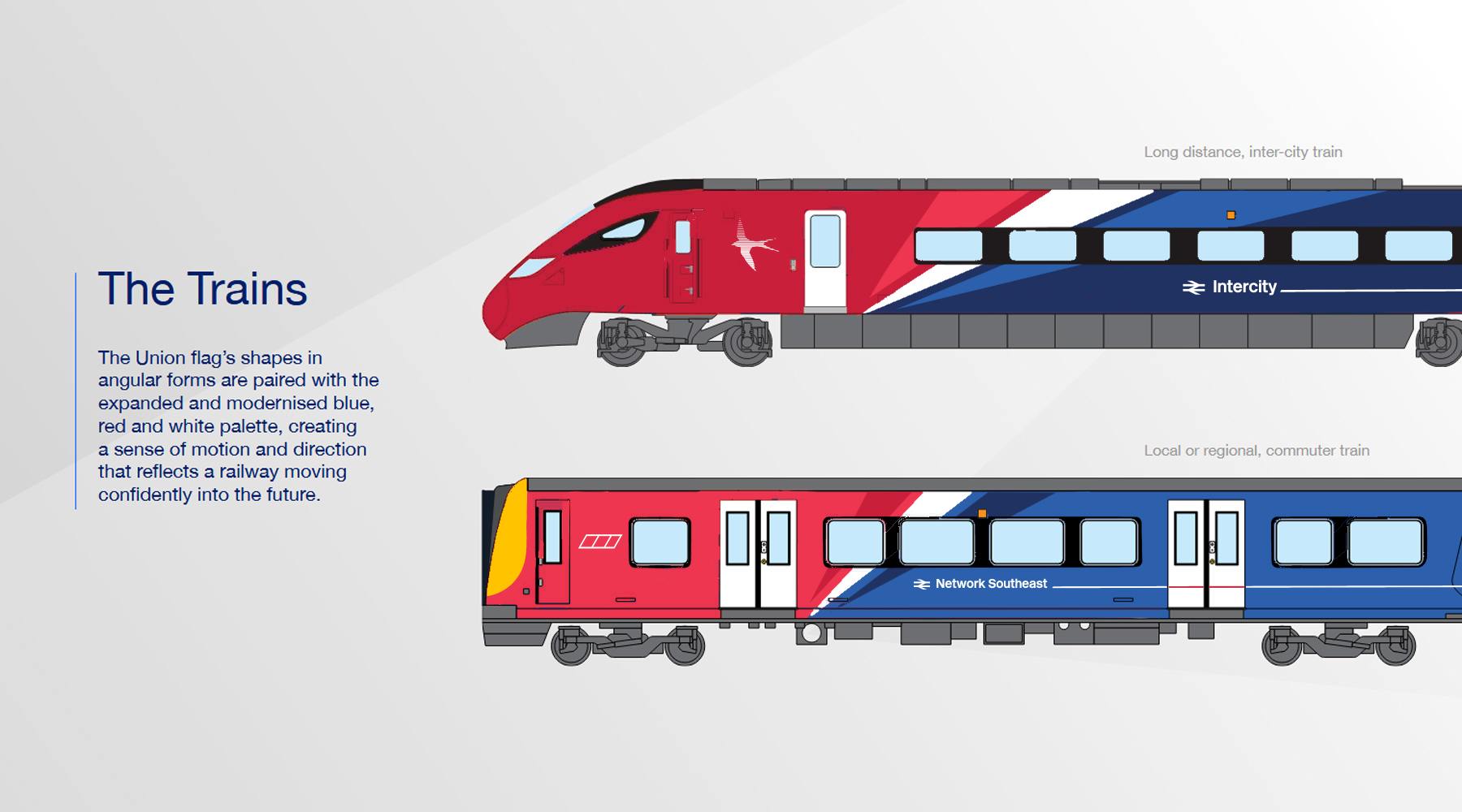
My redesign provided in the image above attempts to solve these issues. I decided to keep the colour pallet the same and retain the sharp angles to resemble to colours of the Union Jack and long distance’ and ‘commuter/regional’ have an inverted colour scheme so the two can be differentiated.
The angled transition between red and blue has white in between so resembling the coloured smoke left behind the red arrows, creating a better sense of national pride than the original design.
Although the stripe on the side of the train was a personal design choice, the contrasting colours (red on white) on the doors could potentially help the visually impaired identify the doors easier making the railway more accessible for everyone.
Conclusion:
If you would like to see a potential redesign then sign this petition! Make your voice heard. If the government wants to constantly remind us that this is a railway owned by us, then we should have a say on what our trains look like.
#RedesignGBR
12
The Issue
Overview:
Recently the UK Government have introduced the brand identity for the new publicly owned railway ‘Great British Railways’. Although it is amazing to see our railways put back into public ownership, the branding doesn’t do it justice and I’m proposing a redesign to rectify some of these issues. And you can help too!
The current brand identity:
The current design looks tacky, poorly designed and gives off a sense of forced patriotism rather than national pride for our country’s railways. It doesn’t complement any train that wears it and certainly isn’t appealing to look at. However, I do not mean any personal offence to the designer, you were just doing your job.
My brand identity proposal:
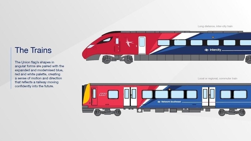
My redesign provided in the image above attempts to solve these issues. I decided to keep the colour pallet the same and retain the sharp angles to resemble to colours of the Union Jack and long distance’ and ‘commuter/regional’ have an inverted colour scheme so the two can be differentiated.
The angled transition between red and blue has white in between so resembling the coloured smoke left behind the red arrows, creating a better sense of national pride than the original design.
Although the stripe on the side of the train was a personal design choice, the contrasting colours (red on white) on the doors could potentially help the visually impaired identify the doors easier making the railway more accessible for everyone.
Conclusion:
If you would like to see a potential redesign then sign this petition! Make your voice heard. If the government wants to constantly remind us that this is a railway owned by us, then we should have a say on what our trains look like.
#RedesignGBR
12
Petition Updates
Share this petition
Petition created on 22 May 2026