New Bath Spa Uni Logo is BS

New Bath Spa Uni Logo is BS
The Issue
As students of Bath Spa University, we disagree with the shocking new university logo. The new logo is low-quality, juvenile, and, quite frankly, a massive downgrade. Bath Spa is a hub of creativity, academic achievements, and invitations; this new logo does not represent any of that. It's fundamentally flawed and unprofessional.
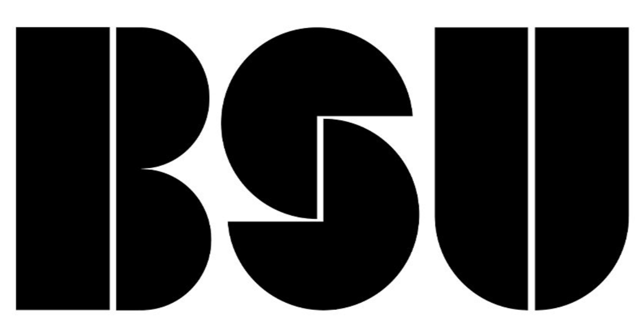
From an academic point of view, this logo is pants:
The spacing on the S is inconsistent. The S seems tiny because the curves of the circles are not accounted for in the baseline. The thickness of the type is unreadable. The logo is not scalable (try scaling it to the size of your fingernail and see if it's still readable; the gaps between the letters melt away). When the logo is inverted, due to the irradiation illusion, the whole logo seems bloated. We understand that one of the logo's drives is that it fits in a circular social media profile. But due to its wideness, it doesn't even do that.
Furthermore, no logo variations exist (as far as we know), meaning it can not work in different formats. Laughably, the new logo is being squished into the old logo's holding shape, eradicating the whole point of this logo being bold and new. We understand the vision behind this new logo, but its craft ultimately lets itself down. Frankly, we agree that Bath Spa's logo could do with an update, but the quality of this one is subpar. It's so disappointing.
Worse, Bath Spa Students were not involved thoroughly enough with this change. As Graphic Design students at Bath Spa, we were shocked to learn that we were not directly consulted on this monumental change in branding. This lack of regard for our opinion is appalling. This change could have been a fantastic opportunity to unite the University in an expansive and extensive group project. The lack of this has left a bitter taste in many student's mouths.
Furthermore, as far as we know, this logo has not entirely replaced the old logo, Leaving Bath Spa in limbo between two identities. This is confusing to students and alienating to applicants. How can Bath Spa applicants trust our university if we can't fully commit to a logo?
To us, it looks very GCSE. If we had seen this logo a few years ago when we applied to Spa's Graphic design course, we would have thought twice about the quality of education that we now know Spa can provide.
We didn't ask for this, we don't want this, and we don't like this. Sign the petition.
The Issue
As students of Bath Spa University, we disagree with the shocking new university logo. The new logo is low-quality, juvenile, and, quite frankly, a massive downgrade. Bath Spa is a hub of creativity, academic achievements, and invitations; this new logo does not represent any of that. It's fundamentally flawed and unprofessional.
From an academic point of view, this logo is pants:
The spacing on the S is inconsistent. The S seems tiny because the curves of the circles are not accounted for in the baseline. The thickness of the type is unreadable. The logo is not scalable (try scaling it to the size of your fingernail and see if it's still readable; the gaps between the letters melt away). When the logo is inverted, due to the irradiation illusion, the whole logo seems bloated. We understand that one of the logo's drives is that it fits in a circular social media profile. But due to its wideness, it doesn't even do that.
Furthermore, no logo variations exist (as far as we know), meaning it can not work in different formats. Laughably, the new logo is being squished into the old logo's holding shape, eradicating the whole point of this logo being bold and new. We understand the vision behind this new logo, but its craft ultimately lets itself down. Frankly, we agree that Bath Spa's logo could do with an update, but the quality of this one is subpar. It's so disappointing.
Worse, Bath Spa Students were not involved thoroughly enough with this change. As Graphic Design students at Bath Spa, we were shocked to learn that we were not directly consulted on this monumental change in branding. This lack of regard for our opinion is appalling. This change could have been a fantastic opportunity to unite the University in an expansive and extensive group project. The lack of this has left a bitter taste in many student's mouths.
Furthermore, as far as we know, this logo has not entirely replaced the old logo, Leaving Bath Spa in limbo between two identities. This is confusing to students and alienating to applicants. How can Bath Spa applicants trust our university if we can't fully commit to a logo?
To us, it looks very GCSE. If we had seen this logo a few years ago when we applied to Spa's Graphic design course, we would have thought twice about the quality of education that we now know Spa can provide.
We didn't ask for this, we don't want this, and we don't like this. Sign the petition.
Petition Closed
Share this petition
Supporter Voices
Petition Updates
Share this petition
Petition created on 5 March 2024