

Honouring both Institutions: Reconsider the new Adelaide University Rebranding
The issue
We are students at the University of Adelaide, and we're reaching out because we feel strongly about the newly unveiled Adelaide University (AU) logo.
The recent unveiling of the new Adelaide University logo has been met with disappointment and frustration among students, alumni, and the wider public. While we understand the need for a fresh identity, we believe it is important to honour the heritage of both constituent universities; this is a merger, not a new institution created from scratch. Many feel that the new design does not represent the universities' storied histories. It feels too corporate and sterile, with only the faintest echoes of its origins and hints of post-rationalisation in its explanation. Pre-emptively dismissing criticism does not detract from an unfortunate design. We seek your understanding that this petition is not against change, but rather against an unfortunate rebranding decision.
We call on the Adelaide University administration to reconsider this change and engage in a more inclusive process that reflects the true spirit of our institutions.
We have also come up with some alternative candidates that preserve the fonts and colours of the rebrand while incorporating elements from the current universities. Here are our ideas:
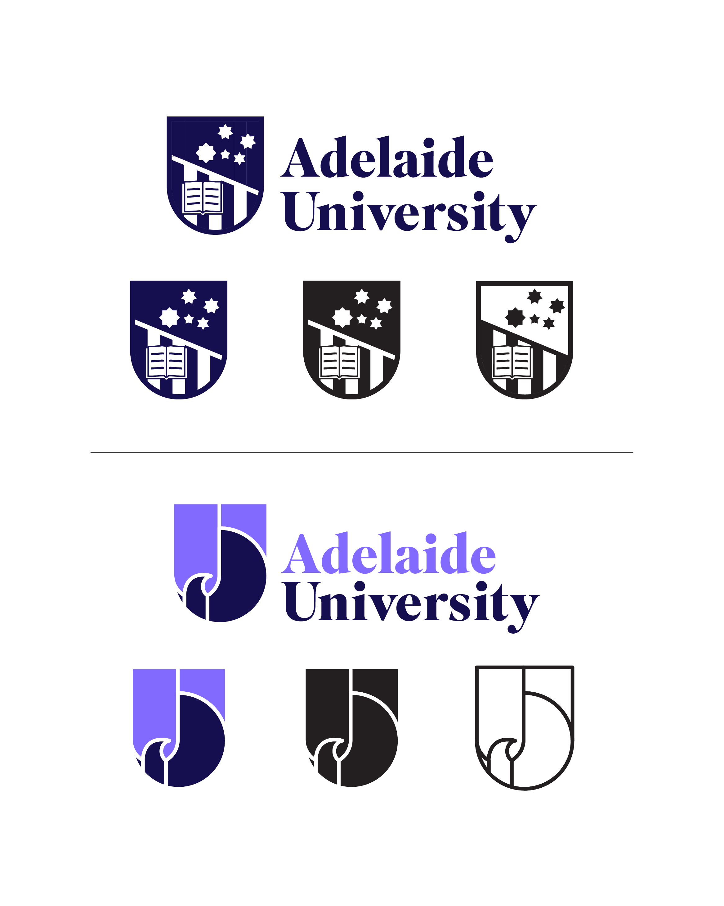
Top Design:
- Combines the open book and Southern Cross from the UofA crest (evoking the "Sub Cruce Lumen" motto)
- Incorporates the stripes and shape of the UniSA logo
- Adds a diagonal line to create the state outline and add dynamism
Bottom Design:
- Features a new shield with the state bird's outstretched wings (similar to the state flag)
- Includes a subtle "U" letter and the state outline at the top right
Utilises "North Terrace Purple" in the design
We believe the new AU logo could still be used as a wordmark, while a more formal crest or seal could be developed to maintain brand identity. Examples like UCLA show that this approach can work without causing confusion.
We propose the following actions on top of considering these logo options:
- Request school administrators to share the logo options in a survey prior to the reveal.
- Allow for a logo design contest open to students, staff, and alumni, ensuring that the new design reflects the community's input and creativity.
Do join us in creating a school logo that truly represents the spirit of our city and state! Let's design a symbol we can all be proud of — one that honours our heritage while embracing our future.
Please sign the petition for a rethink of the Adelaide University logo to ensure that it reflects the pride and legacy of both our institutions. Together, we can create a lasting emblem that celebrates our community and inspires generations to come.
Your suggestions are greatly appreciated! Thank you for your attention and support.
935
The issue
We are students at the University of Adelaide, and we're reaching out because we feel strongly about the newly unveiled Adelaide University (AU) logo.
The recent unveiling of the new Adelaide University logo has been met with disappointment and frustration among students, alumni, and the wider public. While we understand the need for a fresh identity, we believe it is important to honour the heritage of both constituent universities; this is a merger, not a new institution created from scratch. Many feel that the new design does not represent the universities' storied histories. It feels too corporate and sterile, with only the faintest echoes of its origins and hints of post-rationalisation in its explanation. Pre-emptively dismissing criticism does not detract from an unfortunate design. We seek your understanding that this petition is not against change, but rather against an unfortunate rebranding decision.
We call on the Adelaide University administration to reconsider this change and engage in a more inclusive process that reflects the true spirit of our institutions.
We have also come up with some alternative candidates that preserve the fonts and colours of the rebrand while incorporating elements from the current universities. Here are our ideas:
Top Design:
- Combines the open book and Southern Cross from the UofA crest (evoking the "Sub Cruce Lumen" motto)
- Incorporates the stripes and shape of the UniSA logo
- Adds a diagonal line to create the state outline and add dynamism
Bottom Design:
- Features a new shield with the state bird's outstretched wings (similar to the state flag)
- Includes a subtle "U" letter and the state outline at the top right
Utilises "North Terrace Purple" in the design
We believe the new AU logo could still be used as a wordmark, while a more formal crest or seal could be developed to maintain brand identity. Examples like UCLA show that this approach can work without causing confusion.
We propose the following actions on top of considering these logo options:
- Request school administrators to share the logo options in a survey prior to the reveal.
- Allow for a logo design contest open to students, staff, and alumni, ensuring that the new design reflects the community's input and creativity.
Do join us in creating a school logo that truly represents the spirit of our city and state! Let's design a symbol we can all be proud of — one that honours our heritage while embracing our future.
Please sign the petition for a rethink of the Adelaide University logo to ensure that it reflects the pride and legacy of both our institutions. Together, we can create a lasting emblem that celebrates our community and inspires generations to come.
Your suggestions are greatly appreciated! Thank you for your attention and support.
Supporter voices
Petition Updates
Share this petition
Petition created on 25 July 2024