

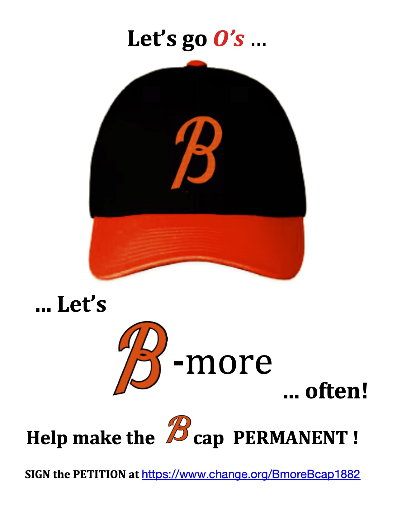
Urge the Orioles to B-more often by making the B-cap permanent!
The Issue
30 MLB Teams & Caps:
27 MLB Teams REPRESENT THEIR HOME locations on their caps:
25 Team Caps with letter(s) for their home city/state/area.
1 Team Cap with a mascot and a symbol for their home country.
(Blue Jays – No history of a letter symbol but use Maple leaf
for pride of country)
1 Team Cap with a letter for the team-name that also represents
their home city. (Angels – 2nd team in LA, on 3rd place name,
but home is the City of Angels)
3 MLB Teams DO NOT REPRESENT THEIR HOME locations on their
caps:
2 Team Caps with letter(s) for team-name:
(White Sox – 2nd team in Chicago, uses ‘Sox’ to distinguish
itself from the Cubs ‘C’)
(Athletics – once the 2nd team in Phila, moved to KC, in 3rd
city, for now at least…)
1 Team Cap with mascot wearing a hat with a letter(s) for the
team-name:
(Orioles – lost National League legacy ‘B’ in 1903, adopted
stick bird logo from minor league predecessor in 1954,
resurrected ‘B’ in 1963, returned to stick bird logo in 1964,
changed to cartoon bird in 1966, changed to ornithologically
correct bird in 1989, added ‘O’s’ as 2nd cap logo in 2005,
returned to cartoon bird in 2012)
The ORIOLES are neither a ‘second team’ (like the ‘Sox’), nor itinerant (like the ‘A’s’).
In fact, given Baltimore’s historic ‘Second City’ status on the east coast among larger cities, and with the periodic bad press, the Orioles should, even more than other teams, proudly sport a B on their caps in solidarity with their hometown. Since the cartoon bird is so loved, just change the 2nd cap. Drop the O’s script and replace it with the city connect B , in orange, and on the cartoon Bird’s cap, too. Like the Raven’s logo. The O’s nick-name is beloved, but our caps should represent Baltimore with a B, and not stick with a carpet-bagging attitude like the A’s on our caps.
So please, let's urge the Orioles to B-more often by making the B cap permanent !!
NO, IT IS NOT A BOSTON B CAP!
And BTW, no one confuses a Cleveland C cap for a Cincinnati or Chicago C cap…

135
The Issue
30 MLB Teams & Caps:
27 MLB Teams REPRESENT THEIR HOME locations on their caps:
25 Team Caps with letter(s) for their home city/state/area.
1 Team Cap with a mascot and a symbol for their home country.
(Blue Jays – No history of a letter symbol but use Maple leaf
for pride of country)
1 Team Cap with a letter for the team-name that also represents
their home city. (Angels – 2nd team in LA, on 3rd place name,
but home is the City of Angels)
3 MLB Teams DO NOT REPRESENT THEIR HOME locations on their
caps:
2 Team Caps with letter(s) for team-name:
(White Sox – 2nd team in Chicago, uses ‘Sox’ to distinguish
itself from the Cubs ‘C’)
(Athletics – once the 2nd team in Phila, moved to KC, in 3rd
city, for now at least…)
1 Team Cap with mascot wearing a hat with a letter(s) for the
team-name:
(Orioles – lost National League legacy ‘B’ in 1903, adopted
stick bird logo from minor league predecessor in 1954,
resurrected ‘B’ in 1963, returned to stick bird logo in 1964,
changed to cartoon bird in 1966, changed to ornithologically
correct bird in 1989, added ‘O’s’ as 2nd cap logo in 2005,
returned to cartoon bird in 2012)
The ORIOLES are neither a ‘second team’ (like the ‘Sox’), nor itinerant (like the ‘A’s’).
In fact, given Baltimore’s historic ‘Second City’ status on the east coast among larger cities, and with the periodic bad press, the Orioles should, even more than other teams, proudly sport a B on their caps in solidarity with their hometown. Since the cartoon bird is so loved, just change the 2nd cap. Drop the O’s script and replace it with the city connect B , in orange, and on the cartoon Bird’s cap, too. Like the Raven’s logo. The O’s nick-name is beloved, but our caps should represent Baltimore with a B, and not stick with a carpet-bagging attitude like the A’s on our caps.
So please, let's urge the Orioles to B-more often by making the B cap permanent !!
NO, IT IS NOT A BOSTON B CAP!
And BTW, no one confuses a Cleveland C cap for a Cincinnati or Chicago C cap…
Petition Updates
Share this petition
Petition created on May 24, 2023