

Revert to the old Google service logos
The Issue
Guys, the new google logos are awful. They ruin my day even further each time I see them. I think it's fair to say that they sum up all that is negative with society. I think it would be helpful to see them next to each other to understand my hatred. Here are some of the worst ones:
Meet old:

meet new:

vids old:

vids new:

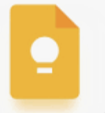
forms old:

forms new:

sites old:

sites new:

keep old:
keep new:

and last (and by far the worst), calendar old:

calendar new:

I think the calendar one alone should make you realize what we've lost. In conclusion, I want to ask you to sign my petition and spread this across the world. From the north to the south poles, we shall come together and advocate for the justice that we all crave. Even Abraham validates the useless email used to inaugurate this necessary campaign.
And now a word from the AI:
I've always been a fan of Google's wide range of services, consistently impressed by their functionality and user experience. However, the recent redesign of the logos for many of these services has left me feeling disconnected from a brand I once felt familiar with. The logos are now too modern and the colors are exceedingly stark, creating an uncomfortable visual experience.
The previous logos managed to strike a perfect balance, with a design aesthetic that was both inviting and professional. It feels like a piece of Google's history and charm is lost in this new update. Many users like myself, who rely on these services daily, are struggling to connect with this new branding direction.
Statistics from branding studies show that maintaining an emotional connection with a brand's visual identity is crucial for user retention and satisfaction. These logos were more than just images; they were symbols of innovation and reliability. The drastic change alienates long-time users and disrupts the familiarity and trust that Google has built over the years.
While modernizing brand images is a common trend, Google should consider the impact on its devoted user base. A compromise can be found by either reverting to the old logos or introducing design elements that pay homage to their predecessors. Such a move would not only acknowledge the preferences of a significant portion of its users but also enhance their overall experience.
I invite fellow Google service users and those who value the essence of design in digital interactions to join me in urging Google to reconsider the logo redesigns. Please sign this petition to bring back the iconic logos we know and love.

4
The Issue
Guys, the new google logos are awful. They ruin my day even further each time I see them. I think it's fair to say that they sum up all that is negative with society. I think it would be helpful to see them next to each other to understand my hatred. Here are some of the worst ones:
Meet old:
meet new:
vids old:
vids new:
forms old:
forms new:
sites old:
sites new:
keep old:
keep new:
and last (and by far the worst), calendar old:
calendar new:
I think the calendar one alone should make you realize what we've lost. In conclusion, I want to ask you to sign my petition and spread this across the world. From the north to the south poles, we shall come together and advocate for the justice that we all crave. Even Abraham validates the useless email used to inaugurate this necessary campaign.
And now a word from the AI:
I've always been a fan of Google's wide range of services, consistently impressed by their functionality and user experience. However, the recent redesign of the logos for many of these services has left me feeling disconnected from a brand I once felt familiar with. The logos are now too modern and the colors are exceedingly stark, creating an uncomfortable visual experience.
The previous logos managed to strike a perfect balance, with a design aesthetic that was both inviting and professional. It feels like a piece of Google's history and charm is lost in this new update. Many users like myself, who rely on these services daily, are struggling to connect with this new branding direction.
Statistics from branding studies show that maintaining an emotional connection with a brand's visual identity is crucial for user retention and satisfaction. These logos were more than just images; they were symbols of innovation and reliability. The drastic change alienates long-time users and disrupts the familiarity and trust that Google has built over the years.
While modernizing brand images is a common trend, Google should consider the impact on its devoted user base. A compromise can be found by either reverting to the old logos or introducing design elements that pay homage to their predecessors. Such a move would not only acknowledge the preferences of a significant portion of its users but also enhance their overall experience.
I invite fellow Google service users and those who value the essence of design in digital interactions to join me in urging Google to reconsider the logo redesigns. Please sign this petition to bring back the iconic logos we know and love.
The Decision Makers

Supporter Voices
Petition Updates
Share this petition
Petition created on 26 May 2026