

Redesign the Nevada State Flag - Embracing the Silver Spirit
Redesign the Nevada State Flag - Embracing the Silver Spirit
The Issue
Nevadans,
I am reaching out to you today with a vision that encapsulates the essence of this beloved Silver State, a vision that seeks to breathe new life into Nevadan identity through a redesigned Nevada state flag. Inspired by the rich history and diverse culture that defines this great state, this new design embraces the very heart and soul of Nevada.
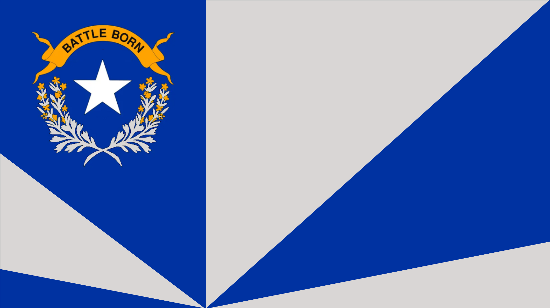
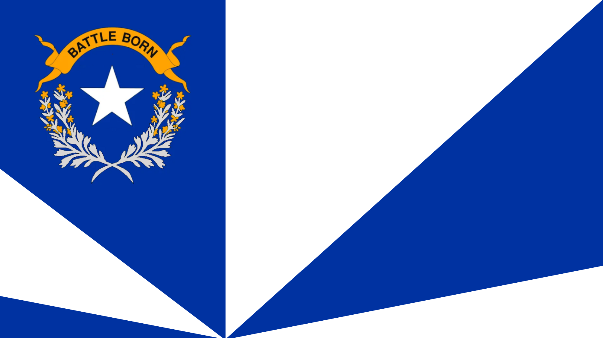
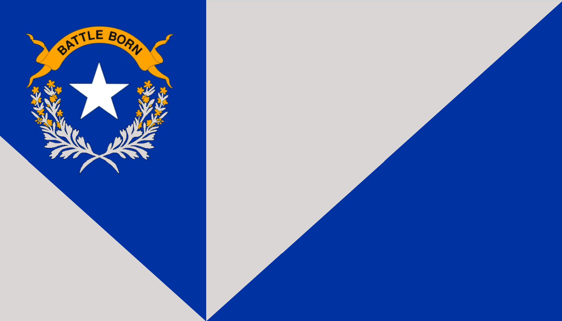
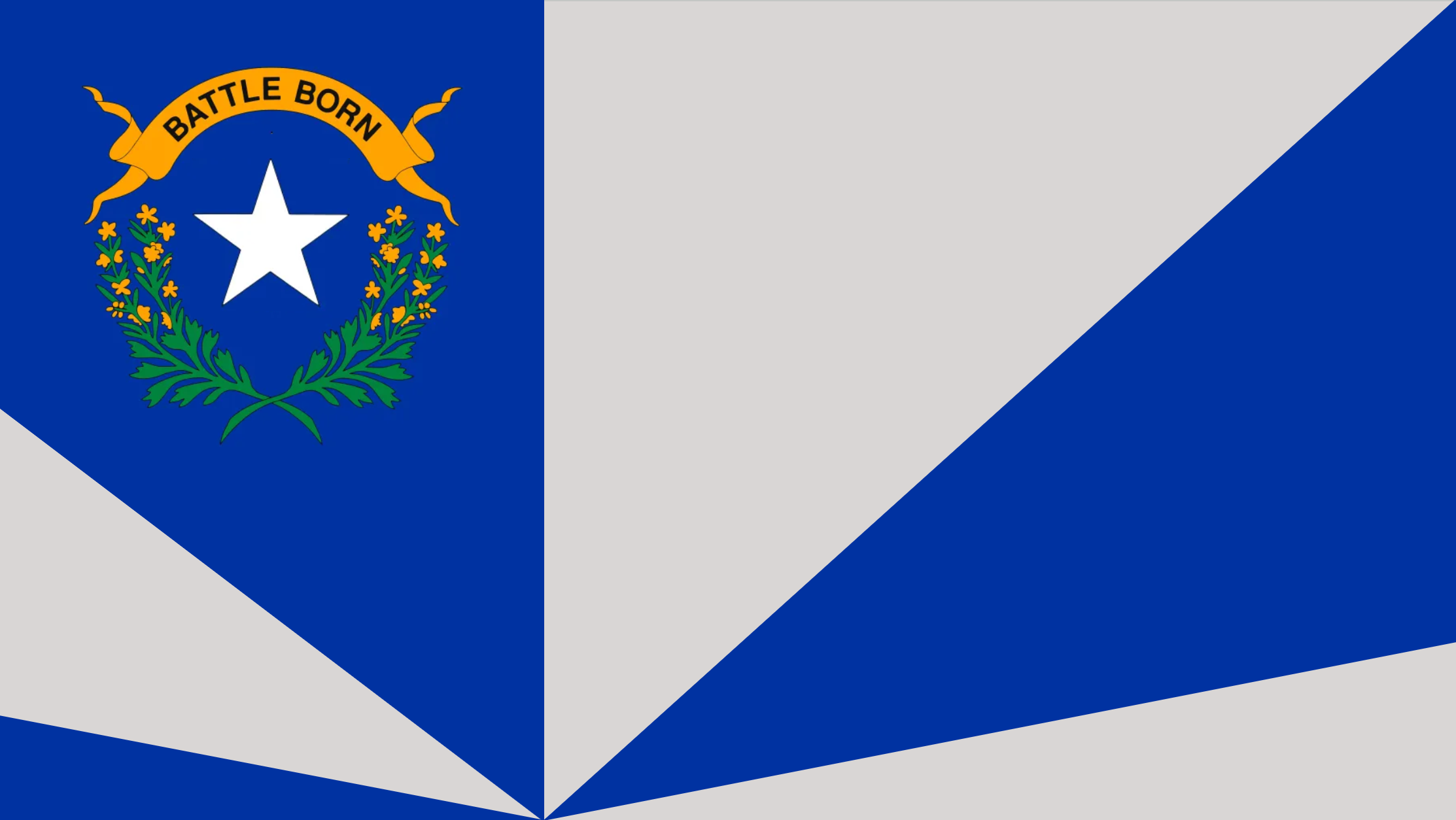
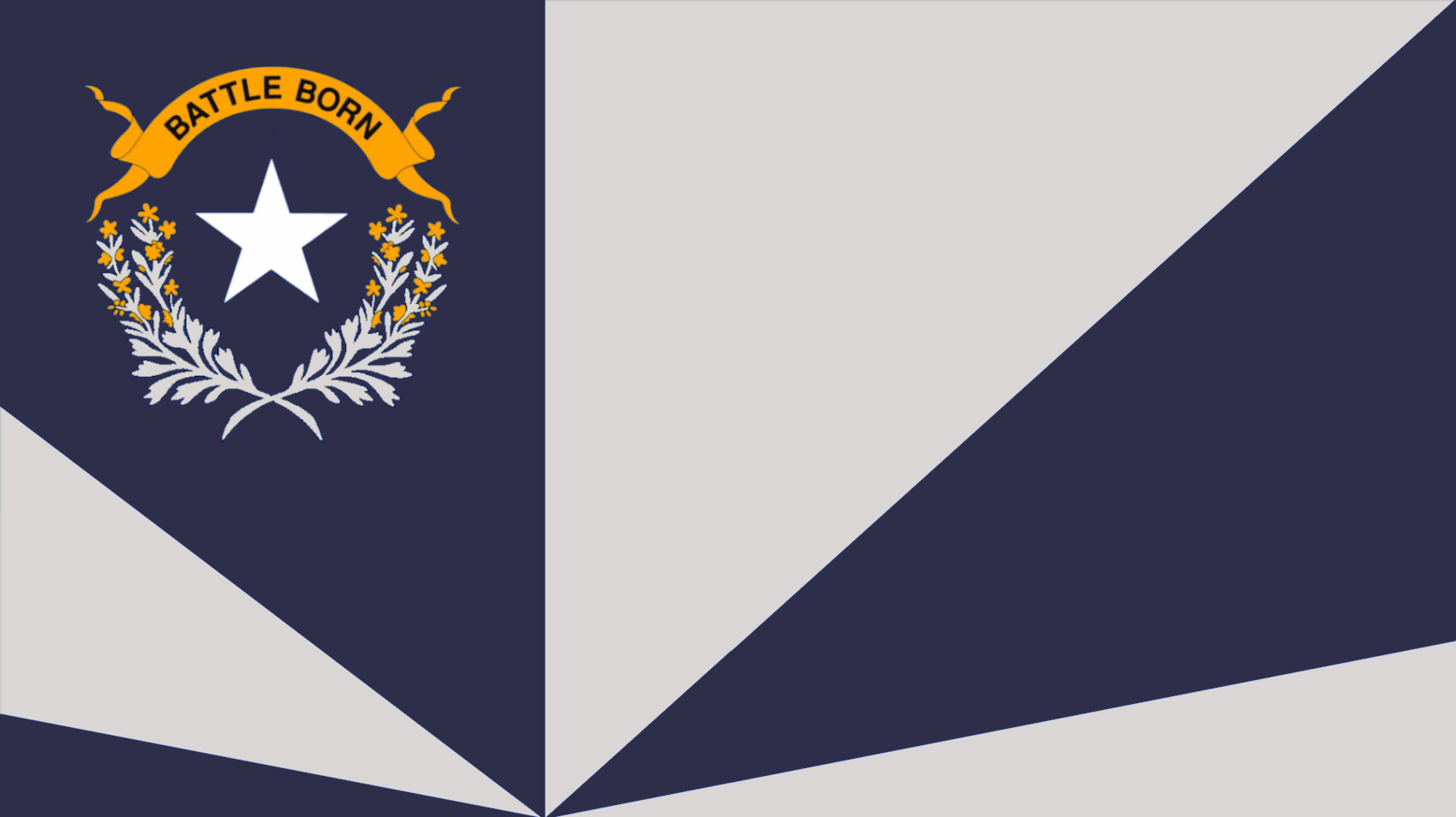
1. Capturing the Silver Spirit:
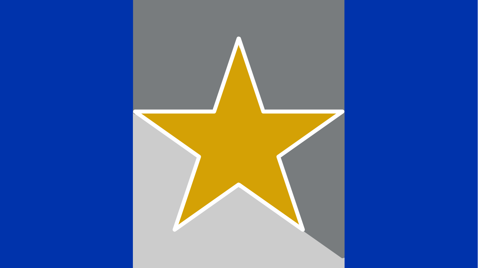
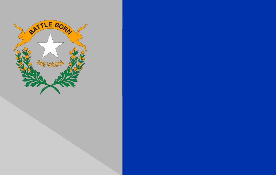
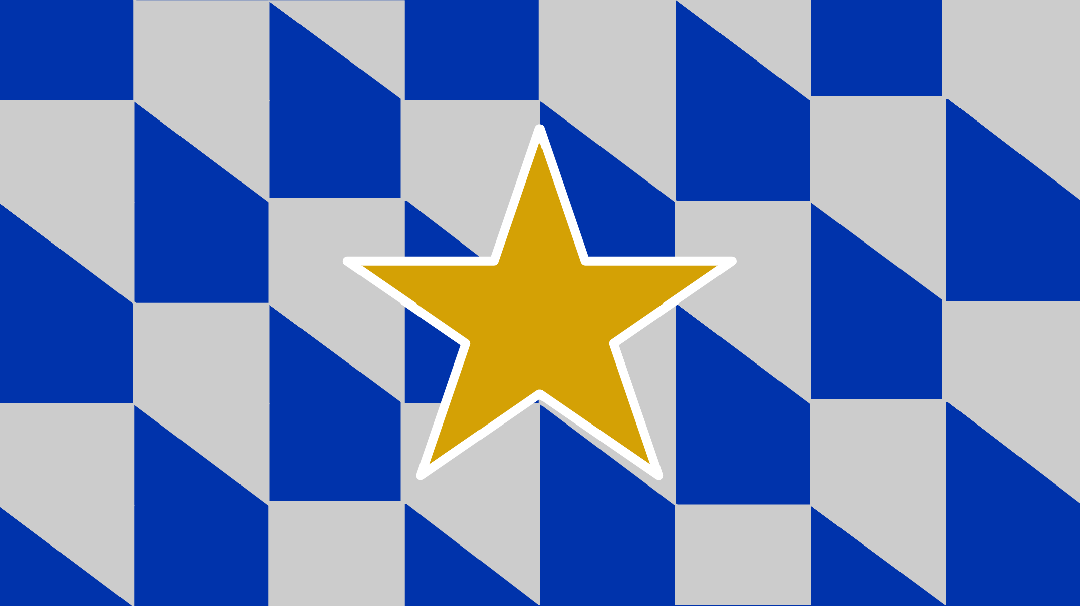
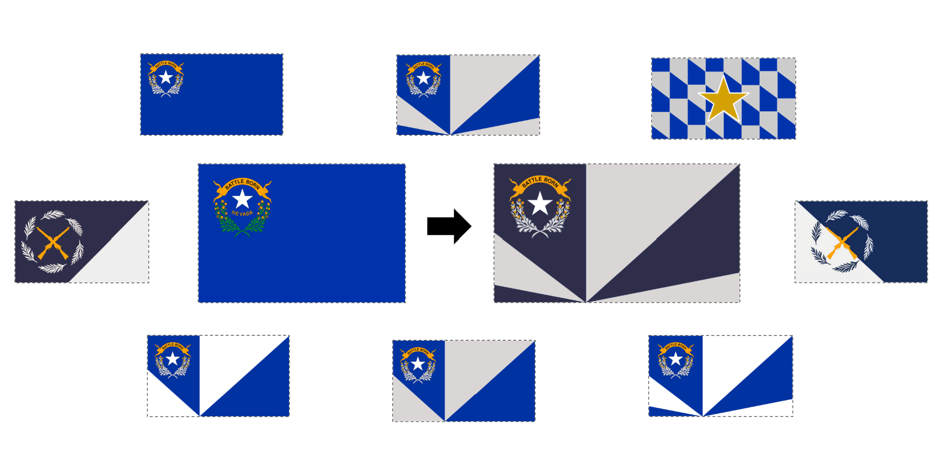
At the heart of the redesign is a celebration of Nevada’s nickname, “The Silver State.” The central silver star, encircled by the sagebrush wreath, stands as a tribute to our state’s rich mining heritage, echoing the importance of silver in shaping the state's economy and identity. The geometric triangle pattern builds upon this theme, with the radiating silver sections symbolizing the enduring impact of the Silver State's natural resources and the resilience of our people. This modern, elegant incorporation of silver tones transforms its mining legacy into a beacon of progress.
2. Embracing Nevada’s Blue Fuel:
The redesign retains and amplifies the symbolic blue field that represents Nevada’s vast skies, pristine waters, and boundless horizons. The blue serves as a backdrop for the striking silver contrasts, reflecting the delicate balance between Nevada’s untamed landscapes and the treasures beneath its soil. Together, the blue and silver embody the unity of its natural beauty and resourceful spirit, creating a visual narrative of both preservation and growth.
3. Radiance of Nevada’s Culture: The outward rays shining from the central star are more than decorative—they are metaphors for Nevada’s vibrant culture and dynamic influence. Just as light spreads from a star into the night sky, the design conveys energy, optimism, and connection. This radiance symbolizes the strength and diversity of Nevada’s people, from the bustling brilliance of Las Vegas to the quiet perseverance of rural communities. It reflects the fusion of tradition and innovation that defines our identity and projects Nevada’s cultural vitality outward for the nation and the world to see. This radial pan puts the spotlight on Nevada, symbolizing the "radiance" of Nevada’s people, industries, and cultural contributions. It reflects the diversity of its communities, from the bustling energy of Las Vegas to the quiet perseverance of rural towns, and the fusion of traditions and innovation that define who Nevadans are.
This design reminds us that Nevada is not only a state of immense natural beauty and historical significance but also a beacon of cultural vitality that impacts the entire nation. Whether it’s through entertainment, innovation, or advocacy for progress, Nevada shines brightly as a leader, spreading its influence far and wide.
4. Recognizable Nevada Shape:
In addition to symbolizing Nevada's radiance, it cleverly integrates the state's shape in the only non-triangular panel.
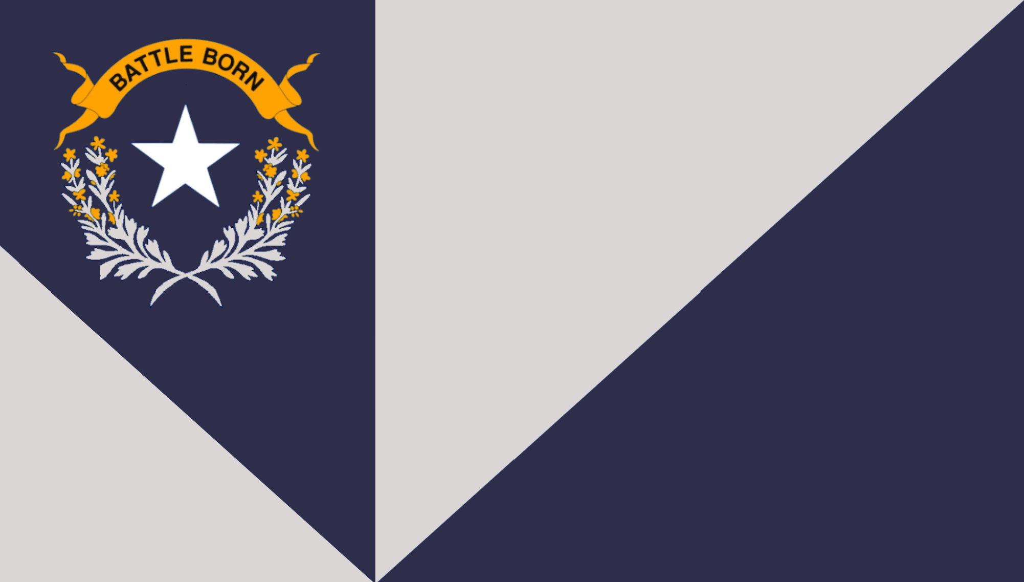
5. “Battle Born” and Sagebrush Roots:
Central to the design is the iconic “Battle Born” banner, which proudly proclaims Nevada’s Civil War-era statehood and resilience. (The blue and gray color scheme also pay tribute to this fact.) Encircling the star, the sagebrush wreath reminds us of the state's natural beauty and hardy landscapes. This harmony between history and nature strengthens the flag's connection to Nevada's heritage while embracing a bold and modern vision for the future.
In this design, Nevada’s past, present, and future converge. It is not merely a flag—it is a celebration of what makes Nevadans Nevadans: resilient, resourceful, and radiant in the face of change.
Let this redesigned flag be a symbol of our progress, pride, and ruggedness.
Sincerely,
Maxwell
Primary Designs:


Bonus Nevada Flag Design Concepts:
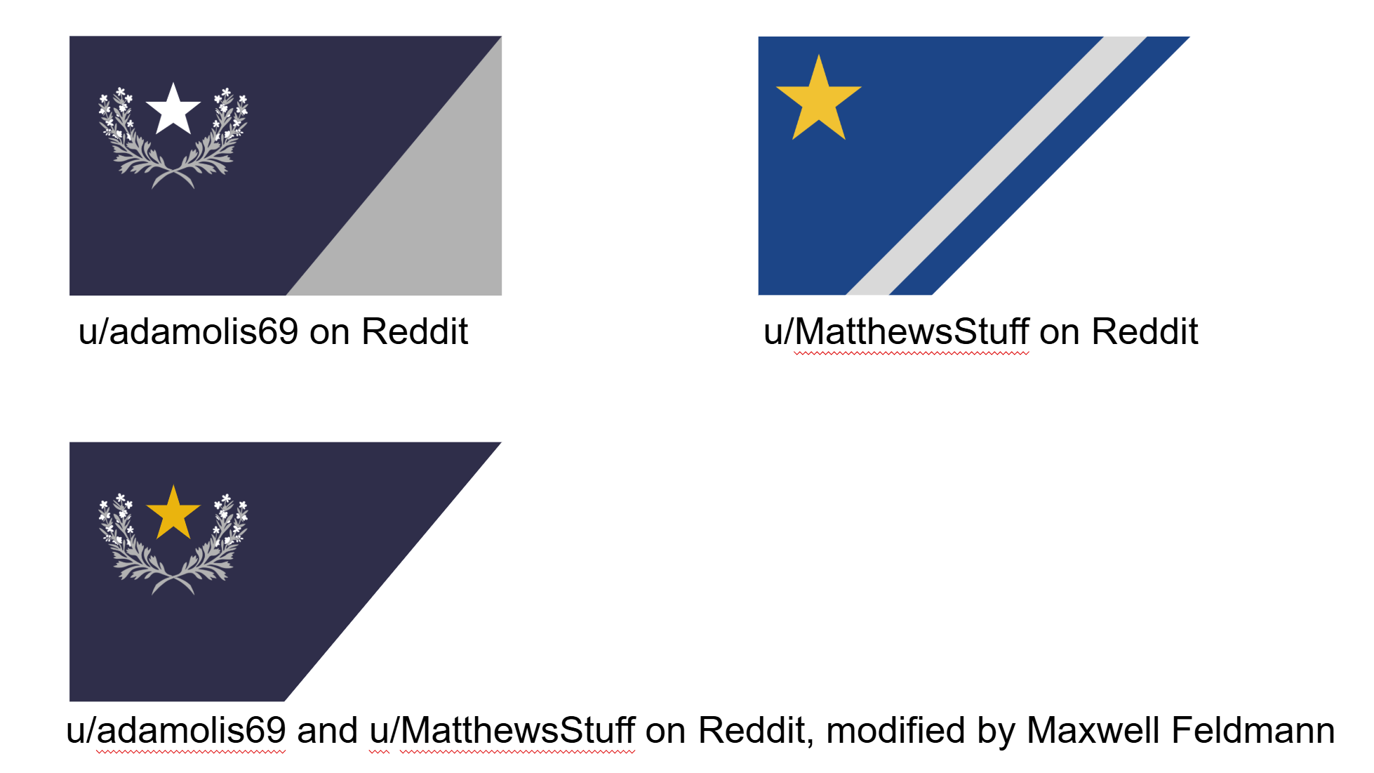
Great Redesigns from other Designers
Thank you for your interest in a better Nevada flag!
34
The Issue
Nevadans,
I am reaching out to you today with a vision that encapsulates the essence of this beloved Silver State, a vision that seeks to breathe new life into Nevadan identity through a redesigned Nevada state flag. Inspired by the rich history and diverse culture that defines this great state, this new design embraces the very heart and soul of Nevada.
1. Capturing the Silver Spirit:
At the heart of the redesign is a celebration of Nevada’s nickname, “The Silver State.” The central silver star, encircled by the sagebrush wreath, stands as a tribute to our state’s rich mining heritage, echoing the importance of silver in shaping the state's economy and identity. The geometric triangle pattern builds upon this theme, with the radiating silver sections symbolizing the enduring impact of the Silver State's natural resources and the resilience of our people. This modern, elegant incorporation of silver tones transforms its mining legacy into a beacon of progress.
2. Embracing Nevada’s Blue Fuel:
The redesign retains and amplifies the symbolic blue field that represents Nevada’s vast skies, pristine waters, and boundless horizons. The blue serves as a backdrop for the striking silver contrasts, reflecting the delicate balance between Nevada’s untamed landscapes and the treasures beneath its soil. Together, the blue and silver embody the unity of its natural beauty and resourceful spirit, creating a visual narrative of both preservation and growth.
3. Radiance of Nevada’s Culture: The outward rays shining from the central star are more than decorative—they are metaphors for Nevada’s vibrant culture and dynamic influence. Just as light spreads from a star into the night sky, the design conveys energy, optimism, and connection. This radiance symbolizes the strength and diversity of Nevada’s people, from the bustling brilliance of Las Vegas to the quiet perseverance of rural communities. It reflects the fusion of tradition and innovation that defines our identity and projects Nevada’s cultural vitality outward for the nation and the world to see. This radial pan puts the spotlight on Nevada, symbolizing the "radiance" of Nevada’s people, industries, and cultural contributions. It reflects the diversity of its communities, from the bustling energy of Las Vegas to the quiet perseverance of rural towns, and the fusion of traditions and innovation that define who Nevadans are.
This design reminds us that Nevada is not only a state of immense natural beauty and historical significance but also a beacon of cultural vitality that impacts the entire nation. Whether it’s through entertainment, innovation, or advocacy for progress, Nevada shines brightly as a leader, spreading its influence far and wide.
4. Recognizable Nevada Shape:
In addition to symbolizing Nevada's radiance, it cleverly integrates the state's shape in the only non-triangular panel.
5. “Battle Born” and Sagebrush Roots:
Central to the design is the iconic “Battle Born” banner, which proudly proclaims Nevada’s Civil War-era statehood and resilience. (The blue and gray color scheme also pay tribute to this fact.) Encircling the star, the sagebrush wreath reminds us of the state's natural beauty and hardy landscapes. This harmony between history and nature strengthens the flag's connection to Nevada's heritage while embracing a bold and modern vision for the future.
In this design, Nevada’s past, present, and future converge. It is not merely a flag—it is a celebration of what makes Nevadans Nevadans: resilient, resourceful, and radiant in the face of change.
Let this redesigned flag be a symbol of our progress, pride, and ruggedness.
Sincerely,
Maxwell
Primary Designs:
Bonus Nevada Flag Design Concepts:
Great Redesigns from other Designers
Thank you for your interest in a better Nevada flag!
34
The Decision Makers


Supporter Voices
Petition Updates
Share this petition
Petition created on January 18, 2024