

Redesign Little Rock's Flag
Redesign Little Rock's Flag
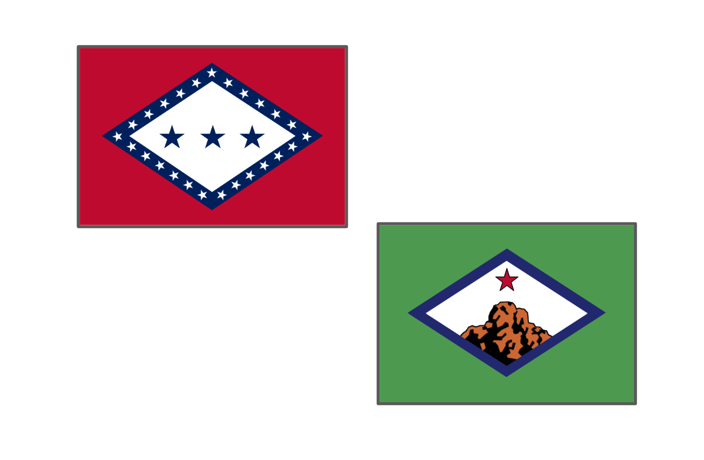
The Issue
Little Rock deserves a flag that clearly reflects its history, geography, and civic identity while also being simple, recognizable, and visually strong. The current city flag contains meaningful symbolism, but its seal-based design limits its effectiveness as a true civic banner. This redesign preserves the intent and meaning of the existing flag while presenting it in a cleaner, more modern, and more memorable form.
The current flag uses blue to represent the Arkansas River, green to symbolize the city’s natural landscape, and a cross-like form to reflect Little Rock’s historic role as a crossroads of Arkansas and the surrounding region. This redesign intentionally retains those same foundational ideas, but expresses them through bold shapes and clear symbolism rather than detailed imagery and text.
The blue framing and white central field continue to reference the Arkansas River as the defining geographic feature of the city—central to Little Rock’s settlement, commerce, and development. At the center of the design is the rock itself, directly representing the city’s name and origin. This grounds the flag in a specific, locally meaningful landmark rather than an abstract seal.
A single red star marks Little Rock’s status as the capital of Arkansas, carrying forward the symbolism of the star found in the current flag’s depiction of the state. The diamond orientation and intersecting geometry echo the original crossroads symbolism, reflecting Little Rock’s long-standing role as a meeting point of river routes, trade, transportation, and government.
Overall, this redesign honors the meaning of Little Rock’s current flag while improving its clarity, recognizability, and ability to inspire civic pride. It replaces complexity with symbolism that works at a distance, on a flagpole, and in the public imagination—creating a flag that better represents Little Rock today while remaining rooted in its history.


43
The Issue
Little Rock deserves a flag that clearly reflects its history, geography, and civic identity while also being simple, recognizable, and visually strong. The current city flag contains meaningful symbolism, but its seal-based design limits its effectiveness as a true civic banner. This redesign preserves the intent and meaning of the existing flag while presenting it in a cleaner, more modern, and more memorable form.
The current flag uses blue to represent the Arkansas River, green to symbolize the city’s natural landscape, and a cross-like form to reflect Little Rock’s historic role as a crossroads of Arkansas and the surrounding region. This redesign intentionally retains those same foundational ideas, but expresses them through bold shapes and clear symbolism rather than detailed imagery and text.
The blue framing and white central field continue to reference the Arkansas River as the defining geographic feature of the city—central to Little Rock’s settlement, commerce, and development. At the center of the design is the rock itself, directly representing the city’s name and origin. This grounds the flag in a specific, locally meaningful landmark rather than an abstract seal.
A single red star marks Little Rock’s status as the capital of Arkansas, carrying forward the symbolism of the star found in the current flag’s depiction of the state. The diamond orientation and intersecting geometry echo the original crossroads symbolism, reflecting Little Rock’s long-standing role as a meeting point of river routes, trade, transportation, and government.
Overall, this redesign honors the meaning of Little Rock’s current flag while improving its clarity, recognizability, and ability to inspire civic pride. It replaces complexity with symbolism that works at a distance, on a flagpole, and in the public imagination—creating a flag that better represents Little Rock today while remaining rooted in its history.
43
The Decision Makers
Petition Updates
Share this petition
Petition created on January 23, 2026