

Redesign Kansas's Flag
The Issue
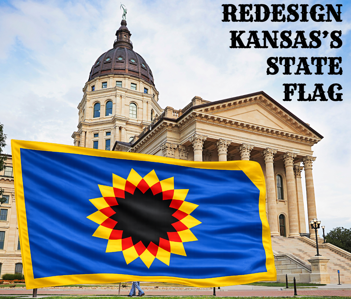
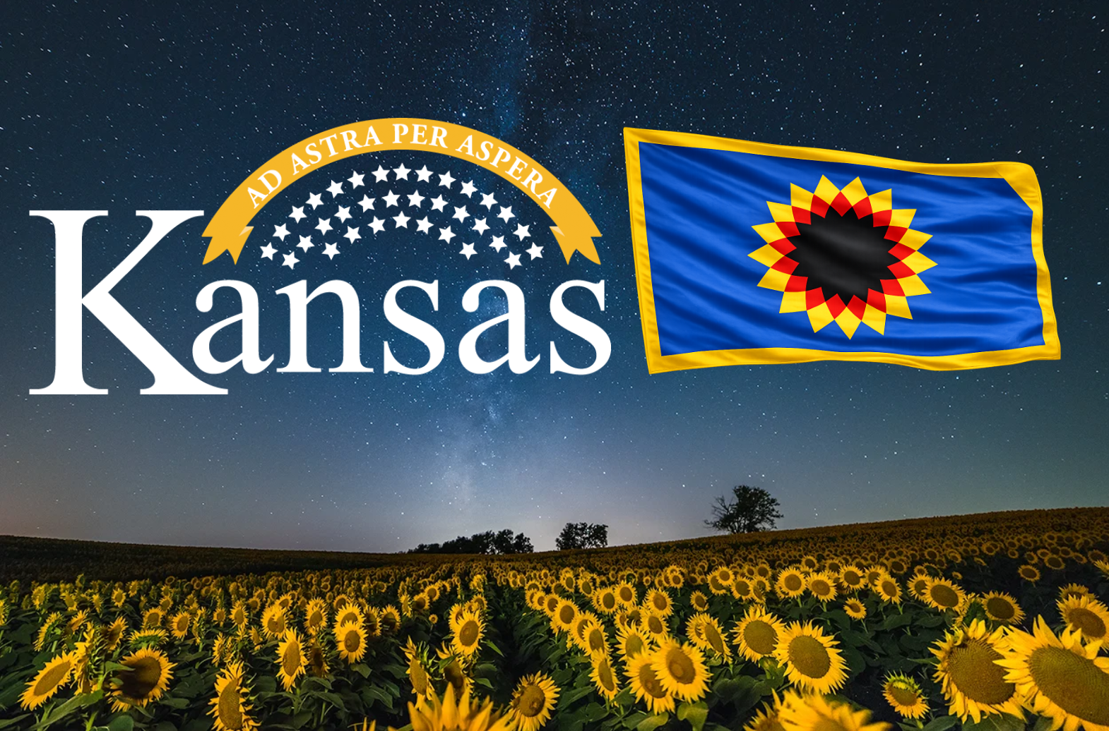
Kansas’s current state flag, with its complex seal and inaccurate depiction of Kansan landscape, fails the modern test of simplicity, recognizability, and symbolism. Great flags tell powerful stories at a glance—and Kansas deserves one that truly captures its identity.
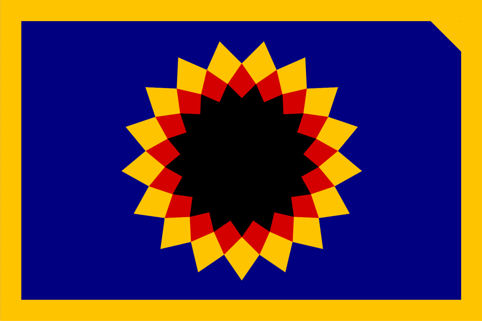
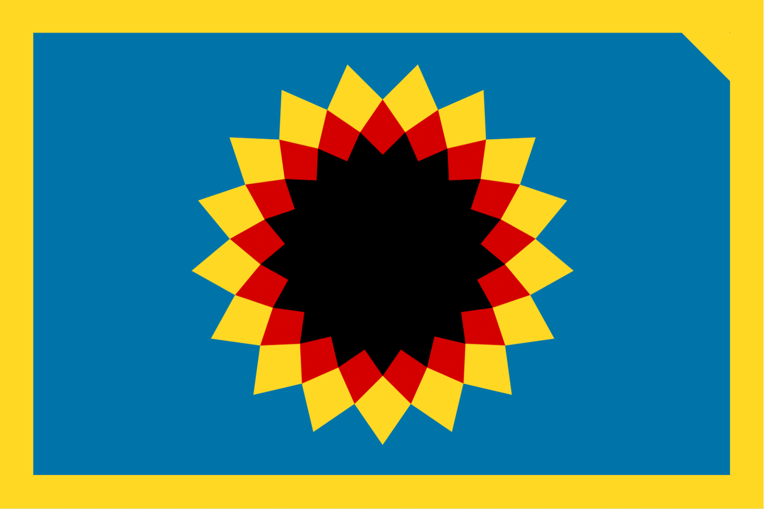
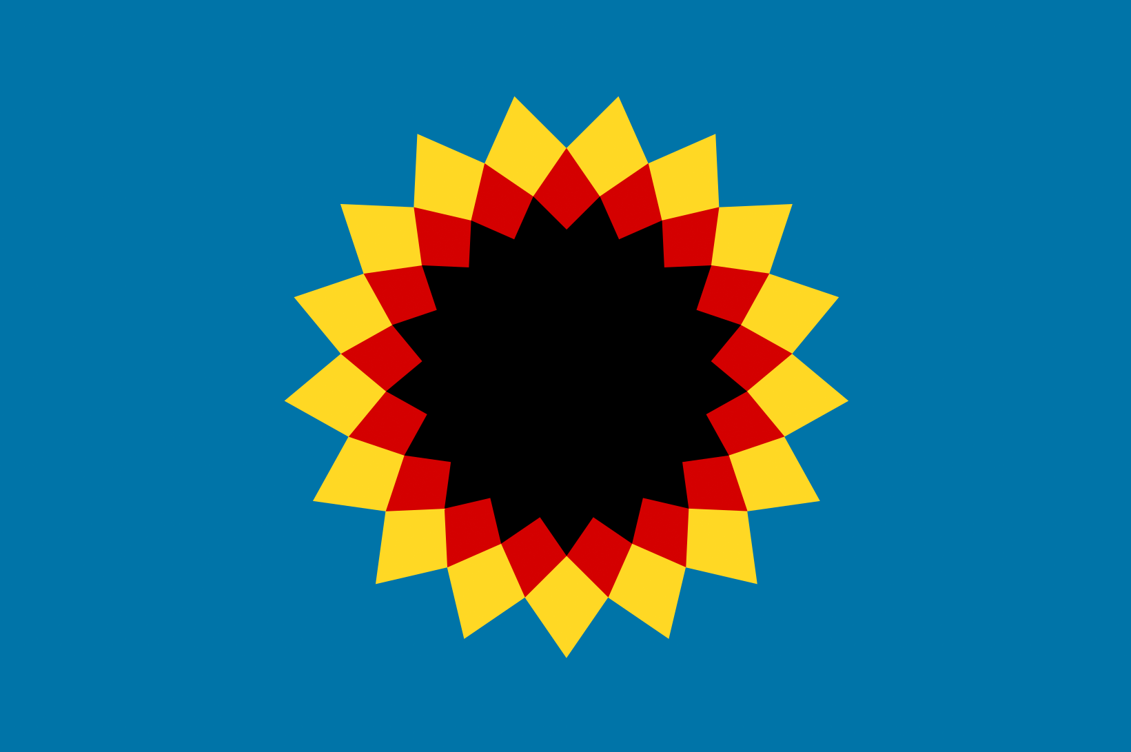
This redesign centers on a geometric sunflower, or "Starflower," rendered in Kansas gold with 34 petals. The design is timeless, balanced, and deeply meaningful.
SYMBOLISM:
- Bottom Petal:
The name “Kansas” comes from the indigenous Kansa people, translating to “People of the South Wind.” This is visually highlighted by the sunflower "pointing down." - Sunflower ("Starflower"):
While most people already know that sunflowers are a cultural staple of Kansas, it has immense symbolism potential beyond mere association with the state. Kansas’s state motto is “Ad Astra Per Aspera,” meaning “to the stars through difficulties.” The sunflower is a weed flower that has traditionally made Kansan agriculture difficult, serving as the “per aspera” part of the motto. Additionally, the design evokes that of a star, serving as the “ad astra” part of the state motto. (And the sunflower’s name comes from the fact that the flower’s head resembles the sun, itself a star, also nodding at the “ad astra” part of the motto.) So, with just the sunflower alone, you have a succinct and beautiful representation of the state motto. - Red:
Red stands for “Bleeding Kansas,” a bloody period of conflict between 1854 and 1859 where pro-slavery and anti-slavery settlers clashed over whether Kansas would be a slave state or a free state. - Blue and Gold:
These colors are derived from the current flag and the state government’s branding guidelines. You can also say that gold represents Kansas’s agriculture, and blue for traditional virtues / ideals like union, justice, etc. - 34 Petals:
The 34 petals (17 yellow, 17 red), in lieu of stars, represent Kansas as the 34th state. The number of petals in sunflowers typically follow the Fibonacci sequence in the numbering of petals, which includes the number 34, so it’s actually fairly common to find real life sunflowers with exactly 34 petals. - Notch:
The notch is a lighthearted reference to Kansas’s distinctive shape: a rectangle with a little notch in its Northeast corner. It’s optional and can easily be removed if it’s not wanted on the flag.
If you think it's time for Kansas to have a better flag, please sign and share this petition.
22
The Issue
Kansas’s current state flag, with its complex seal and inaccurate depiction of Kansan landscape, fails the modern test of simplicity, recognizability, and symbolism. Great flags tell powerful stories at a glance—and Kansas deserves one that truly captures its identity.
This redesign centers on a geometric sunflower, or "Starflower," rendered in Kansas gold with 34 petals. The design is timeless, balanced, and deeply meaningful.
SYMBOLISM:
- Bottom Petal:
The name “Kansas” comes from the indigenous Kansa people, translating to “People of the South Wind.” This is visually highlighted by the sunflower "pointing down." - Sunflower ("Starflower"):
While most people already know that sunflowers are a cultural staple of Kansas, it has immense symbolism potential beyond mere association with the state. Kansas’s state motto is “Ad Astra Per Aspera,” meaning “to the stars through difficulties.” The sunflower is a weed flower that has traditionally made Kansan agriculture difficult, serving as the “per aspera” part of the motto. Additionally, the design evokes that of a star, serving as the “ad astra” part of the state motto. (And the sunflower’s name comes from the fact that the flower’s head resembles the sun, itself a star, also nodding at the “ad astra” part of the motto.) So, with just the sunflower alone, you have a succinct and beautiful representation of the state motto. - Red:
Red stands for “Bleeding Kansas,” a bloody period of conflict between 1854 and 1859 where pro-slavery and anti-slavery settlers clashed over whether Kansas would be a slave state or a free state. - Blue and Gold:
These colors are derived from the current flag and the state government’s branding guidelines. You can also say that gold represents Kansas’s agriculture, and blue for traditional virtues / ideals like union, justice, etc. - 34 Petals:
The 34 petals (17 yellow, 17 red), in lieu of stars, represent Kansas as the 34th state. The number of petals in sunflowers typically follow the Fibonacci sequence in the numbering of petals, which includes the number 34, so it’s actually fairly common to find real life sunflowers with exactly 34 petals. - Notch:
The notch is a lighthearted reference to Kansas’s distinctive shape: a rectangle with a little notch in its Northeast corner. It’s optional and can easily be removed if it’s not wanted on the flag.
If you think it's time for Kansas to have a better flag, please sign and share this petition.


Petition Updates
Share this petition
Petition created on April 30, 2026