
Illinois Flag Redesign
The Issue
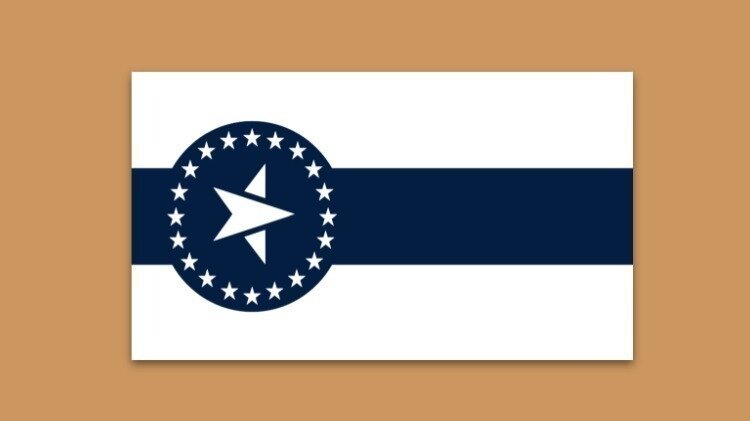
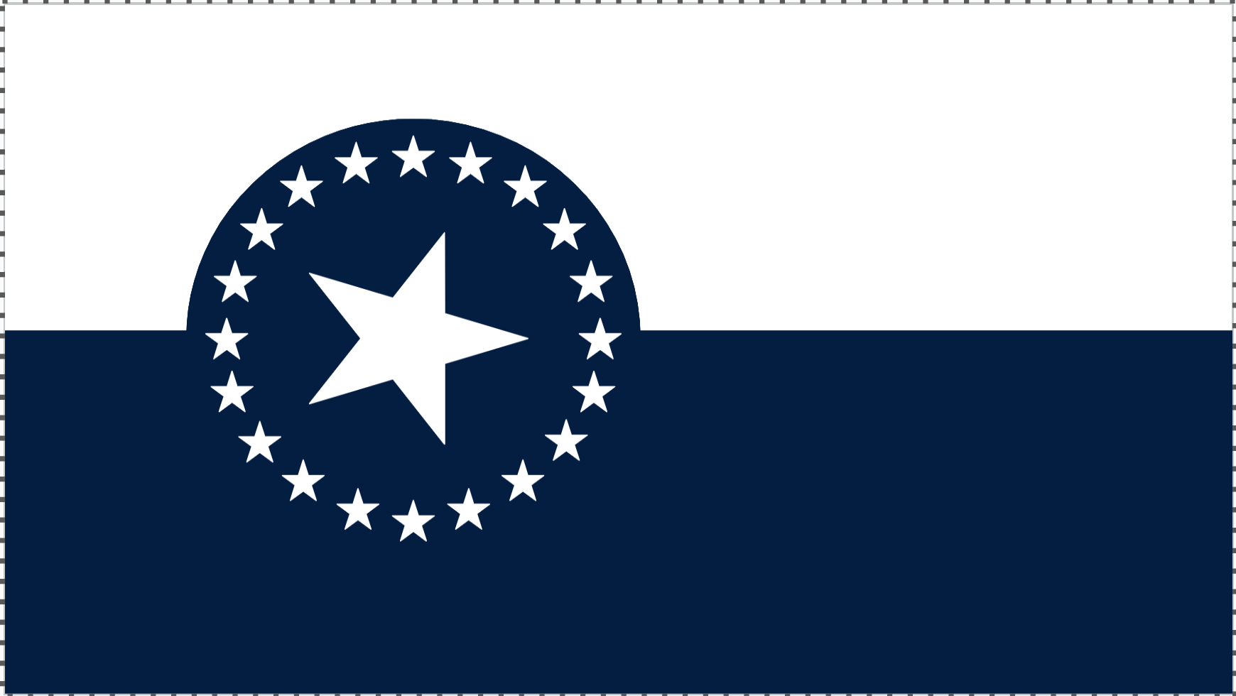
Overview: As many are aware, the State of Illinois is considering a redesign of its state flag and is holding a redesign contest. As such, I am publicly posting my submitted design to allow others to learn about the symbolism in my proposed redesign. My redesign of the Illinois state flag is one that I believe will resonate with and unify all Illinoisans–from Cairo to Chicago. This redesigned Illinois state flag takes inspiration from Springfield’s flag and Illinois’s Centennial Flag, presenting a clean and streamlined yet traditional and grounded interpretation of the state's identity, focusing on symbolism that represents Illinois' values of progress, innovation, and unity. The central feature of the flag is a prominent star embedded with an arrow encircled by 20 five-point stars, which serves as the primary visual element, encapsulating the state's collective forward-looking spirit. The design is deliberately minimalistic (though not excessively so), avoiding excessive embellishments and staying true to the "honest" simplicity characteristic of Illinoisans, symbolized primarily by the dominant use of white.
Symbolism:
Old Glory Blue: The blue is specifically Old Glory Blue, the same shade as the blue in the American flag. This color choice further strengthens the connection to national symbolism and Lincoln’s legacy.
White Field: The white background carries multiple layers of meaning. It symbolizes Illinois's status as a free state and its strong stance on abolition, which played a significant role during the Civil War. Additionally, this choice reflects the state's commitment to transparency and truth in governance and public life. Finally, the white field represents the simplicity and honesty associated with the people of Illinois–especially in agriculture–qualities that are deeply rooted in the state's identity. The white field also adds a sense of continuity, borrowing it from the current flag. (As a bonus, Illinois also happens to have a couple of "white" official state symbols--the white-tailed deer and the white oak tree).
Union of Stars: The circle of mullets (five-pointed stars) represents "union"--a direct nod to President Abraham Lincoln's legacy and his crucial role in preserving the Union during the Civil War. The circular arrangement of stars emphasizes the idea of unity and collective strength, reflecting Illinois's commitment to national unity. Additionally, it symbolizes the shared value of community in the state.
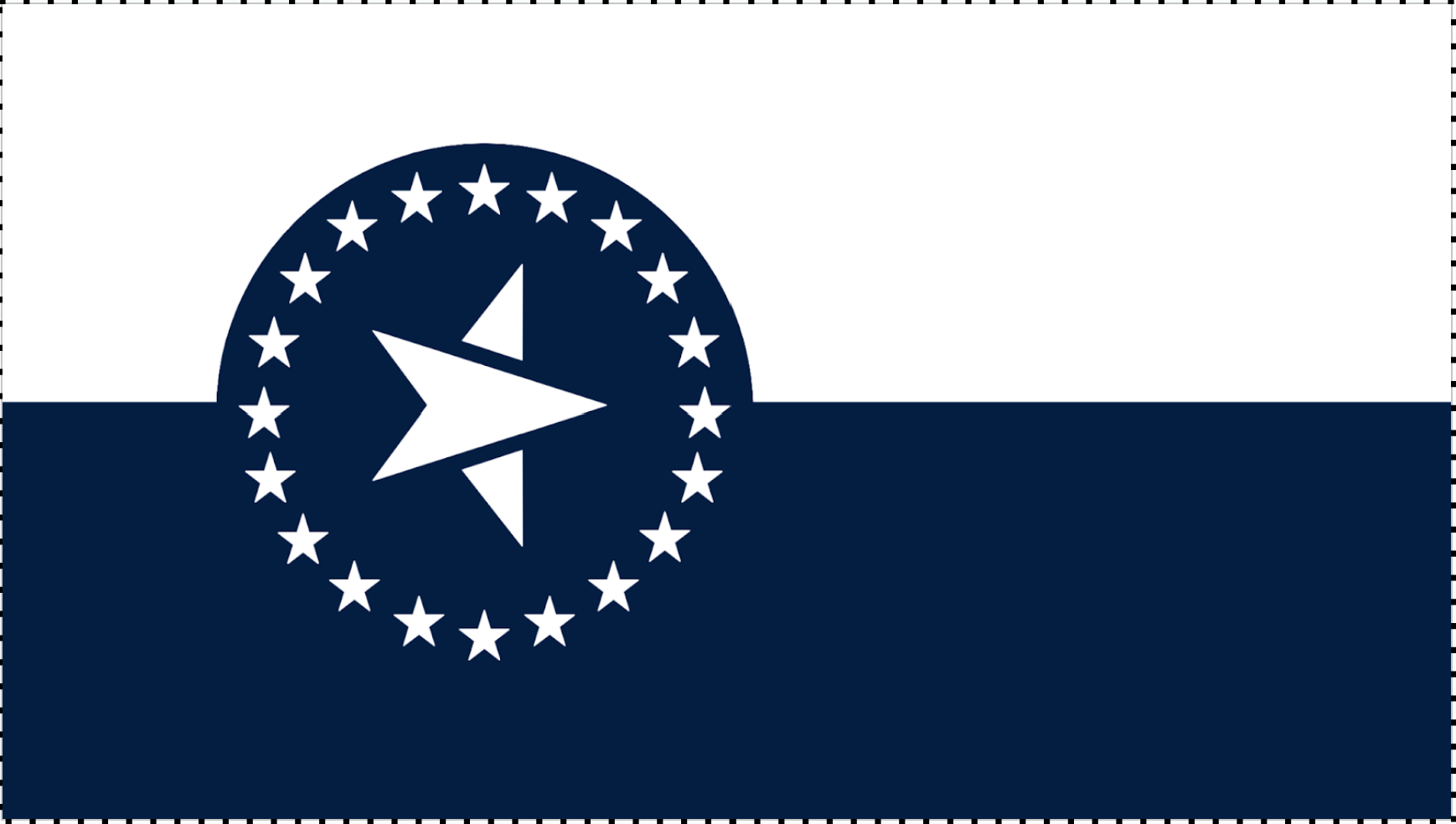
“National Unity and State Sovereignty”: The defining feature of this flag is its stars. A ring of 20 stars, representing the first 20 states admitted to the Union, encircles a large central star symbolizing Illinois as the 21st state. Together, these 21 stars express the state motto, “State Sovereignty, National Unity,” with the surrounding circle representing national unity and the central star representing state sovereignty. Positioned within the ring, the Illinois star underscores Illinois’s place within the Union while standing out by pointing toward the fly (to the right). This orientation highlights Illinois as a center of progress, symbolizing its forward momentum and contributions to national advancement. The blue field (National Union) and white stars (state sovereignty) further emphasize the state motto, while the uniform upward orientation of the surrounding stars represents the states’ shared foundation in the guiding ideals that elevate and sustain the Union.
Central Star with Embedded Arrow (can be replaced with a "regular" 5-point star): At the core of the flag is a unique, bold, five-pointed star, representing Illinois itself—its people, its strength, and its place in the nation. Within this star is an embedded arrow, pointing towards the fly (to the right), symbolizing the state's commitment to progress and innovation, as well as a sense of unity and shared purpose among Illinosians. By integrating the arrow into the star and having the star "point" to the fly the design suggests that the path to progress is woven into the very fabric of Illinois' identity. This arrow suggests continuous movement towards a brighter future, aligning with Illinois' historical role as a leader in political thought, agriculture, industry, technology, and social advancement. The star (and the circle) is off-centered towards the hoist side (left side), visually conveying that progress and innovation are never fully complete. The design conveys a message of optimism and a relentless pursuit of growth and improvement, illustrating Illinois' role as a beacon of leadership and hope, both within the state and beyond. Even if the star is replaced with a "regular" five-point star, the same symbolism can be carried over. (As a bonus, it also can be interpreted as a top-down view of an ax chopping a piece of wood, another nod to Lincoln as “The Rail Splitter.”)
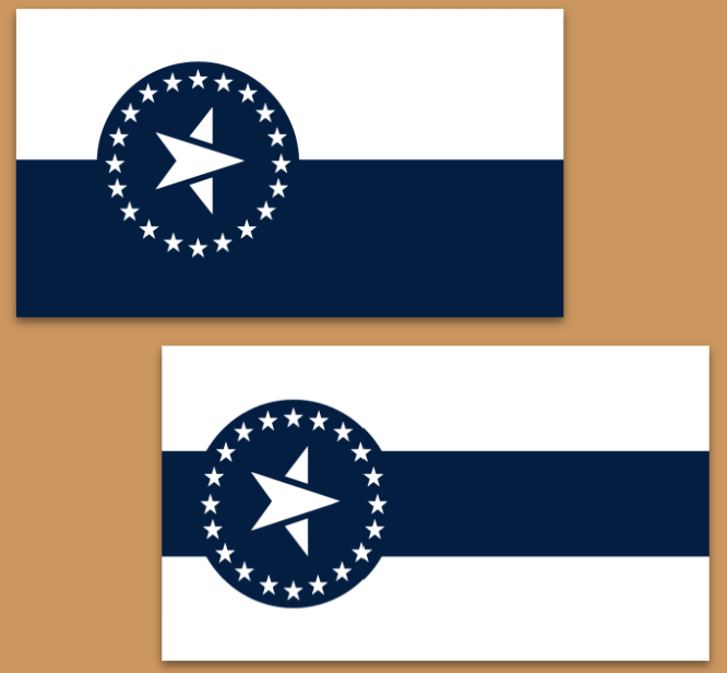
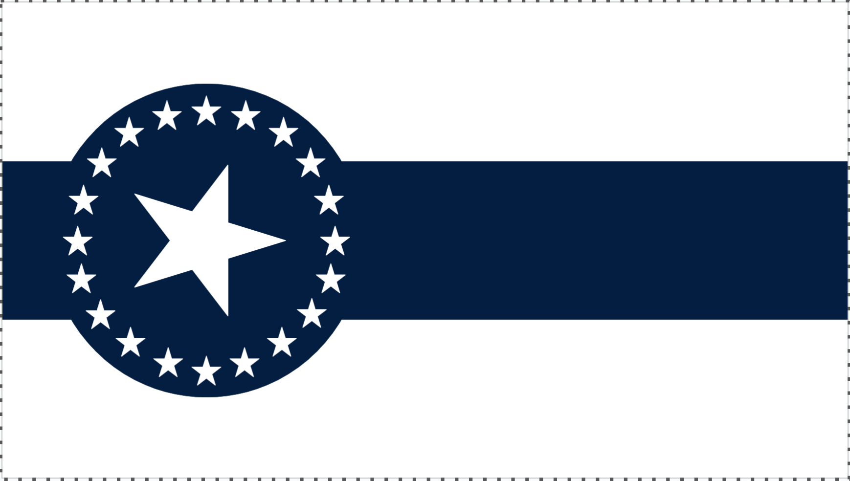
Illinois Plains: The bicolor fesse in submission #4 mimics the iconic scenery of the Illinois Plains under an open sky, with the blue representing the former and the white representing the latter. The tricolor fesse in submission #3 also accomplishes this, but now the bottom white represents the plains, the blue stripe represents the sky, and the upper white represents the clouds.
Cahokia Mounds: Due to the blue circle being superimposed on a stripe of the same color, a subtle visual 'bump' effect emerges. On the bicolor version (submission #4), this bump appears once, while in the tricolor design (submission #3), it creates two distinct bumps. These bumps symbolically reference the Cahokia Mounds, representing Illinois' deep indigenous history and the state's connection to the ancient Mississippian civilization that once thrived here
Regional Representation: For the the white-blue-white tri-color fesse (submission #3), the horizontal stripes represent Illinois’s 3 main regions: Southern, Central, and Northern. For the bi-color version (submission #4), this is satisfied by the 3 components of the central star.
American-esque Design: The flag's design is distinctly American in its aesthetics, reflecting Illinois's position as a microcosm of the broader United States (and more generally as one of the United States). This reinforces the idea that Illinois embodies the diverse and dynamic character of the nation as a whole.
Conclusion: This redesigned Illinois state flag is a powerful symbol of the state's enduring commitment to progress, innovation, and unity. By focusing on a simple yet striking design, the flag captures the essence of Illinois' identity in a way that is both modern and timeless. The minimalistic approach, centered around the "honest" white background, reinforces the state's values and ensures that the flag remains a clear and compelling representation of Illinois' place in the nation.
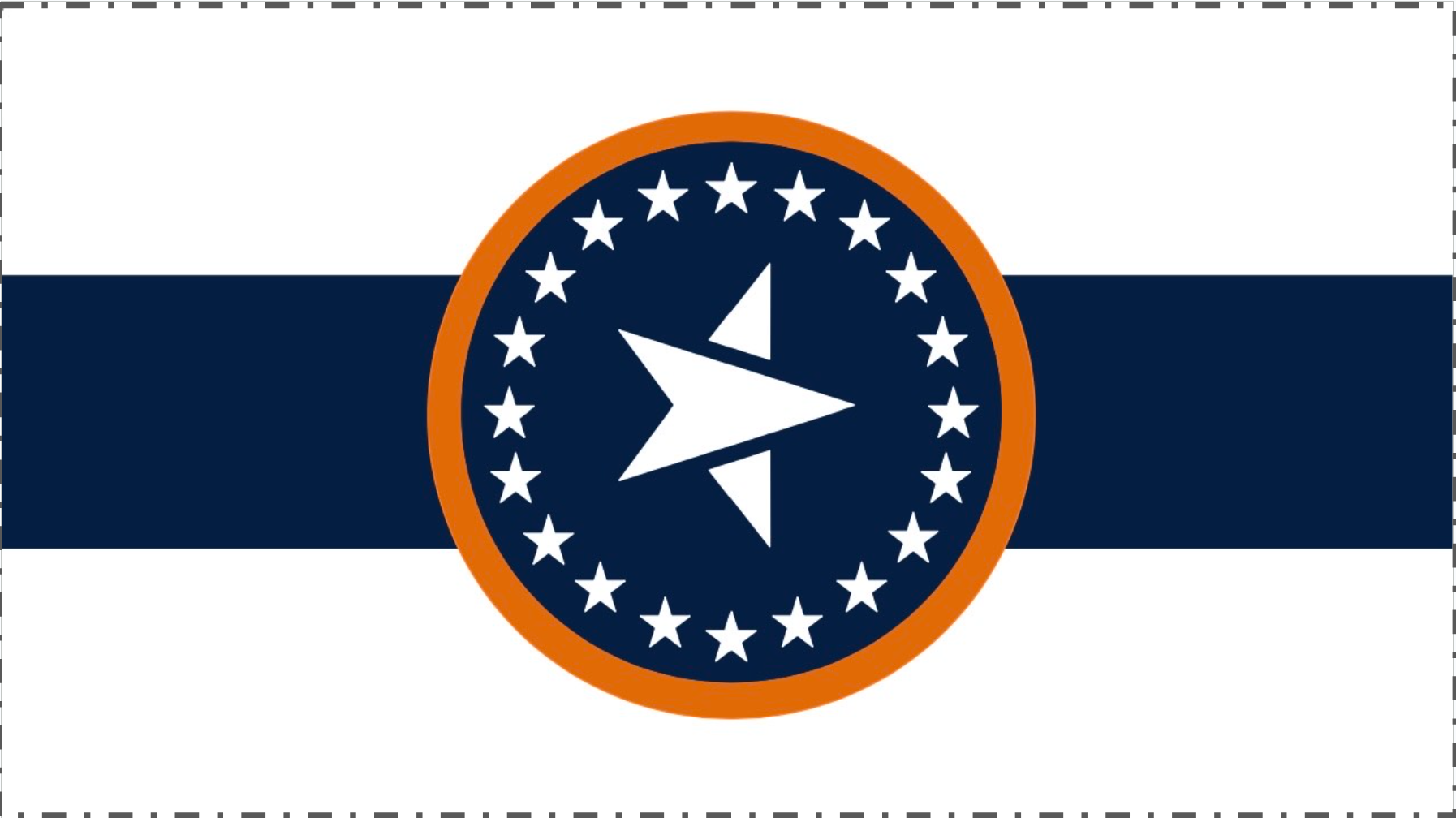
Optional Variations (Agricultural Symbolism): I believe the simplicity of the design and the use of white is sufficient to carry the agricultural spirit of the state. However, if there is desire for a more explicit representation of the state’s (massive) agricultural scene, I would suggest adding a small amount of yellow/orange gold. This would probably be best accomplished by adding fimbriation (though I avoid tracing the circle), or by recoloring the star(s). This said, it may alter the color balance a bit of the current two-tone flag design. Another possible option is to replace the blue with "Lincoln Green," which would strengthen the agricultural element while not completely abandoning the Union and Lincoln symbolism associated with the Union Blue.
Possible Variations: If desired, these designs can instead bear a "normal" five-point star. Because the star is "pointing" forward, the symbolism attributed in the original designs should remain intact.

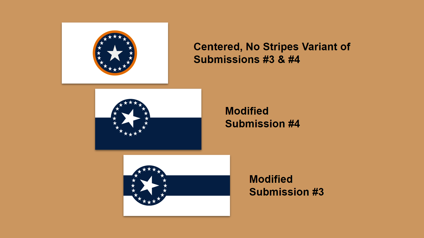
Other Modified Alternatives:


Why not the Illinois Centennial Flag?
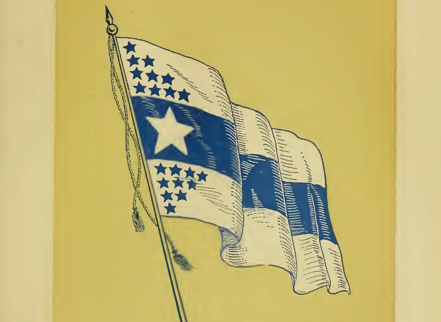
For Illinois's first 100 years of statehood in 1918, Wallace Rice, who designed Chicago's flag, designed a flag for the state's centennial anniversary. While this flag is ingeniously simple, unique, and would make for a great Illinois state flag, I argue that it could potentially cause some controversy in its arrangement of its 20 blue stars, which represents the 10 northern and 10 southern states admitted to the Union before Illinois. While this harkens back to Abraham Lincoln and the Civil War, it may emphasize division more than unity. Additionally, the symbolism is a bit weak. My proposed redesign resolves both of these potential issues by emphasizing union and making additional references to the state motto and Cahokia Mounds--all while having a highly attractive (and highly related) design.
To be clear, the Illinois Centennial Flag would indeed be an excellent flag for the state to adopt as its official flag. However, I believe that it does have some potential weaknesses that could cause controversy. If the Centennial Flag is not considered on account of those issues, I believe that my flag is an attractive alternative that resolves the problematic areas of the Centennial Flag and incorporates all the symbolism in it--and then some!
18
The Issue
Overview: As many are aware, the State of Illinois is considering a redesign of its state flag and is holding a redesign contest. As such, I am publicly posting my submitted design to allow others to learn about the symbolism in my proposed redesign. My redesign of the Illinois state flag is one that I believe will resonate with and unify all Illinoisans–from Cairo to Chicago. This redesigned Illinois state flag takes inspiration from Springfield’s flag and Illinois’s Centennial Flag, presenting a clean and streamlined yet traditional and grounded interpretation of the state's identity, focusing on symbolism that represents Illinois' values of progress, innovation, and unity. The central feature of the flag is a prominent star embedded with an arrow encircled by 20 five-point stars, which serves as the primary visual element, encapsulating the state's collective forward-looking spirit. The design is deliberately minimalistic (though not excessively so), avoiding excessive embellishments and staying true to the "honest" simplicity characteristic of Illinoisans, symbolized primarily by the dominant use of white.
Symbolism:
Old Glory Blue: The blue is specifically Old Glory Blue, the same shade as the blue in the American flag. This color choice further strengthens the connection to national symbolism and Lincoln’s legacy.
White Field: The white background carries multiple layers of meaning. It symbolizes Illinois's status as a free state and its strong stance on abolition, which played a significant role during the Civil War. Additionally, this choice reflects the state's commitment to transparency and truth in governance and public life. Finally, the white field represents the simplicity and honesty associated with the people of Illinois–especially in agriculture–qualities that are deeply rooted in the state's identity. The white field also adds a sense of continuity, borrowing it from the current flag. (As a bonus, Illinois also happens to have a couple of "white" official state symbols--the white-tailed deer and the white oak tree).
Union of Stars: The circle of mullets (five-pointed stars) represents "union"--a direct nod to President Abraham Lincoln's legacy and his crucial role in preserving the Union during the Civil War. The circular arrangement of stars emphasizes the idea of unity and collective strength, reflecting Illinois's commitment to national unity. Additionally, it symbolizes the shared value of community in the state.
“National Unity and State Sovereignty”: The defining feature of this flag is its stars. A ring of 20 stars, representing the first 20 states admitted to the Union, encircles a large central star symbolizing Illinois as the 21st state. Together, these 21 stars express the state motto, “State Sovereignty, National Unity,” with the surrounding circle representing national unity and the central star representing state sovereignty. Positioned within the ring, the Illinois star underscores Illinois’s place within the Union while standing out by pointing toward the fly (to the right). This orientation highlights Illinois as a center of progress, symbolizing its forward momentum and contributions to national advancement. The blue field (National Union) and white stars (state sovereignty) further emphasize the state motto, while the uniform upward orientation of the surrounding stars represents the states’ shared foundation in the guiding ideals that elevate and sustain the Union.
Central Star with Embedded Arrow (can be replaced with a "regular" 5-point star): At the core of the flag is a unique, bold, five-pointed star, representing Illinois itself—its people, its strength, and its place in the nation. Within this star is an embedded arrow, pointing towards the fly (to the right), symbolizing the state's commitment to progress and innovation, as well as a sense of unity and shared purpose among Illinosians. By integrating the arrow into the star and having the star "point" to the fly the design suggests that the path to progress is woven into the very fabric of Illinois' identity. This arrow suggests continuous movement towards a brighter future, aligning with Illinois' historical role as a leader in political thought, agriculture, industry, technology, and social advancement. The star (and the circle) is off-centered towards the hoist side (left side), visually conveying that progress and innovation are never fully complete. The design conveys a message of optimism and a relentless pursuit of growth and improvement, illustrating Illinois' role as a beacon of leadership and hope, both within the state and beyond. Even if the star is replaced with a "regular" five-point star, the same symbolism can be carried over. (As a bonus, it also can be interpreted as a top-down view of an ax chopping a piece of wood, another nod to Lincoln as “The Rail Splitter.”)
Illinois Plains: The bicolor fesse in submission #4 mimics the iconic scenery of the Illinois Plains under an open sky, with the blue representing the former and the white representing the latter. The tricolor fesse in submission #3 also accomplishes this, but now the bottom white represents the plains, the blue stripe represents the sky, and the upper white represents the clouds.
Cahokia Mounds: Due to the blue circle being superimposed on a stripe of the same color, a subtle visual 'bump' effect emerges. On the bicolor version (submission #4), this bump appears once, while in the tricolor design (submission #3), it creates two distinct bumps. These bumps symbolically reference the Cahokia Mounds, representing Illinois' deep indigenous history and the state's connection to the ancient Mississippian civilization that once thrived here
Regional Representation: For the the white-blue-white tri-color fesse (submission #3), the horizontal stripes represent Illinois’s 3 main regions: Southern, Central, and Northern. For the bi-color version (submission #4), this is satisfied by the 3 components of the central star.
American-esque Design: The flag's design is distinctly American in its aesthetics, reflecting Illinois's position as a microcosm of the broader United States (and more generally as one of the United States). This reinforces the idea that Illinois embodies the diverse and dynamic character of the nation as a whole.
Conclusion: This redesigned Illinois state flag is a powerful symbol of the state's enduring commitment to progress, innovation, and unity. By focusing on a simple yet striking design, the flag captures the essence of Illinois' identity in a way that is both modern and timeless. The minimalistic approach, centered around the "honest" white background, reinforces the state's values and ensures that the flag remains a clear and compelling representation of Illinois' place in the nation.
Optional Variations (Agricultural Symbolism): I believe the simplicity of the design and the use of white is sufficient to carry the agricultural spirit of the state. However, if there is desire for a more explicit representation of the state’s (massive) agricultural scene, I would suggest adding a small amount of yellow/orange gold. This would probably be best accomplished by adding fimbriation (though I avoid tracing the circle), or by recoloring the star(s). This said, it may alter the color balance a bit of the current two-tone flag design. Another possible option is to replace the blue with "Lincoln Green," which would strengthen the agricultural element while not completely abandoning the Union and Lincoln symbolism associated with the Union Blue.
Possible Variations: If desired, these designs can instead bear a "normal" five-point star. Because the star is "pointing" forward, the symbolism attributed in the original designs should remain intact.
Other Modified Alternatives:
Why not the Illinois Centennial Flag?
For Illinois's first 100 years of statehood in 1918, Wallace Rice, who designed Chicago's flag, designed a flag for the state's centennial anniversary. While this flag is ingeniously simple, unique, and would make for a great Illinois state flag, I argue that it could potentially cause some controversy in its arrangement of its 20 blue stars, which represents the 10 northern and 10 southern states admitted to the Union before Illinois. While this harkens back to Abraham Lincoln and the Civil War, it may emphasize division more than unity. Additionally, the symbolism is a bit weak. My proposed redesign resolves both of these potential issues by emphasizing union and making additional references to the state motto and Cahokia Mounds--all while having a highly attractive (and highly related) design.
To be clear, the Illinois Centennial Flag would indeed be an excellent flag for the state to adopt as its official flag. However, I believe that it does have some potential weaknesses that could cause controversy. If the Centennial Flag is not considered on account of those issues, I believe that my flag is an attractive alternative that resolves the problematic areas of the Centennial Flag and incorporates all the symbolism in it--and then some!
The Decision Makers


Petition Updates
Share this petition
Petition created on October 5, 2024