Change the City Flag of Acworth, GA

Change the City Flag of Acworth, GA
The Issue
A city flag is an important symbol of the city and its residents. Currently, Acworth residents feel overshadowed by the nearby Atlanta. In the words of the wise Krish Khosla, "Currently, our flag is boring and dull. I feel that Acworth is always sidelined by the larger city of Atlanta near it; citizens of Acworth may even consider themselves citizens of Atlanta. Our flag doesn’t help in this one bit, and changing the flag could make the people living in Acworth care more about their city and their community. This petition could also show people that they have the power to change things." Our current, unofficial flag does an inadequate job of representing the city. Here's why:
According to the North American Vexillological Association (i.e., experts on flags), there are 5 rules to a great flag that people want representing them:
Rule 1: Keep it simple.
A great flag is one that a kid can draw from memory. The current flag of Acworth's flag is overwhelming and busy. Many of the best-rated, most loved-by-residents city flags, such as Tulsa, Oklahoma and Denver, Colorado, have anywhere from 2-5 elements. Acworth's flag doubles that number, with an astounding 10 separate graphical elements to memorize. The flag is not only too complicated, but the swirl design and text make the flag harder and a lot more expensive to sew together.
Rule 2: Every element of the flag should be meaningful.
Each element on a great flag should symbolize something. Some of the flag elements do mean something, such as the Lantern of Hope, but most of the elements mean nothing. The swirls on either side of the oval, for example, are just there to make it look fancy. The shadows on the inside of the light pole only complicate the flag further and serve no purpose. The city's URL on the bottom of the flag is the biggest grievance. Flags don't need URLs. The acworth.org website is the first result to a simple Google search.
Rule 3: Use a few basic colors.
To make a flag easier on the eyes, include only a few colors, ideally each with meaning to them. The flags mentioned earlier only have 3-4 colors. The flag of Acworth has 6 colors, some of which are hard to find fabric in. The multitude of colors make the flag hard to distinguish from a distance and more complicated than necessary. Flags should also look good in black & white. In the grayscale flag of Acworth, the colors meld together and make it difficult to tell what's what.
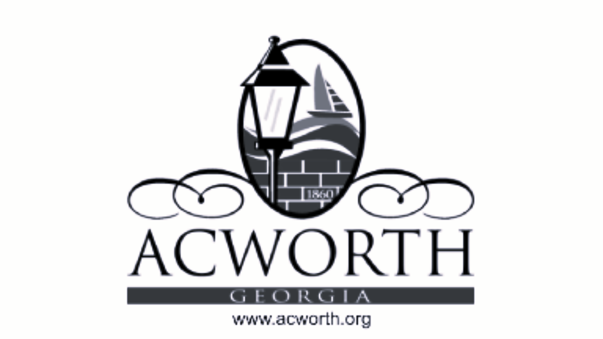
Rule 4: No lettering or seals.
Putting letters or seals on flags makes them too complicated. Text on flags defeats the whole purpose of a flag. Flags should be symbolic. Instead of the 50 stars and 13 stripes of the American flag, why don't we just replace it with the text, "U.S.A." on a white background? Looking at a flag should be looking at a piece of art, not an English class assignment. Don't confuse a flag with a banner: banners are large, don't flap, and are meant to be looked at closer. Our current flag would work great as a banner: symbolism, important date, city name are all included, but not a flag. Text on the flag makes it impossible to shrink down, and it's not reversible, meaning the text would have to be sewed on each side, costing more money and fabric. It's not only inconvenient, but inefficient.
Rule 5: Be distinct or related.
A good flag is recognizable, distinguishable, and have its own identity. The flag of Acworth employs and overused trope of city (and even state) flags. It's the city seal/logo on a boring white background. This has been done countless times, and citizens of places with such flags hate them. Here's the list of the 25 lowest-rated city flags. As you can see, almost all of them are a city logo on a solid background. The current flag of Acworth is not distinctive, and it just duplicates the many, many city (and even state!) flags that use the logo-on-solid background trope.

65
The Issue
A city flag is an important symbol of the city and its residents. Currently, Acworth residents feel overshadowed by the nearby Atlanta. In the words of the wise Krish Khosla, "Currently, our flag is boring and dull. I feel that Acworth is always sidelined by the larger city of Atlanta near it; citizens of Acworth may even consider themselves citizens of Atlanta. Our flag doesn’t help in this one bit, and changing the flag could make the people living in Acworth care more about their city and their community. This petition could also show people that they have the power to change things." Our current, unofficial flag does an inadequate job of representing the city. Here's why:
According to the North American Vexillological Association (i.e., experts on flags), there are 5 rules to a great flag that people want representing them:
Rule 1: Keep it simple.
A great flag is one that a kid can draw from memory. The current flag of Acworth's flag is overwhelming and busy. Many of the best-rated, most loved-by-residents city flags, such as Tulsa, Oklahoma and Denver, Colorado, have anywhere from 2-5 elements. Acworth's flag doubles that number, with an astounding 10 separate graphical elements to memorize. The flag is not only too complicated, but the swirl design and text make the flag harder and a lot more expensive to sew together.
Rule 2: Every element of the flag should be meaningful.
Each element on a great flag should symbolize something. Some of the flag elements do mean something, such as the Lantern of Hope, but most of the elements mean nothing. The swirls on either side of the oval, for example, are just there to make it look fancy. The shadows on the inside of the light pole only complicate the flag further and serve no purpose. The city's URL on the bottom of the flag is the biggest grievance. Flags don't need URLs. The acworth.org website is the first result to a simple Google search.
Rule 3: Use a few basic colors.
To make a flag easier on the eyes, include only a few colors, ideally each with meaning to them. The flags mentioned earlier only have 3-4 colors. The flag of Acworth has 6 colors, some of which are hard to find fabric in. The multitude of colors make the flag hard to distinguish from a distance and more complicated than necessary. Flags should also look good in black & white. In the grayscale flag of Acworth, the colors meld together and make it difficult to tell what's what.
Rule 4: No lettering or seals.
Putting letters or seals on flags makes them too complicated. Text on flags defeats the whole purpose of a flag. Flags should be symbolic. Instead of the 50 stars and 13 stripes of the American flag, why don't we just replace it with the text, "U.S.A." on a white background? Looking at a flag should be looking at a piece of art, not an English class assignment. Don't confuse a flag with a banner: banners are large, don't flap, and are meant to be looked at closer. Our current flag would work great as a banner: symbolism, important date, city name are all included, but not a flag. Text on the flag makes it impossible to shrink down, and it's not reversible, meaning the text would have to be sewed on each side, costing more money and fabric. It's not only inconvenient, but inefficient.
Rule 5: Be distinct or related.
A good flag is recognizable, distinguishable, and have its own identity. The flag of Acworth employs and overused trope of city (and even state) flags. It's the city seal/logo on a boring white background. This has been done countless times, and citizens of places with such flags hate them. Here's the list of the 25 lowest-rated city flags. As you can see, almost all of them are a city logo on a solid background. The current flag of Acworth is not distinctive, and it just duplicates the many, many city (and even state!) flags that use the logo-on-solid background trope.
65
The Decision Makers
Supporter Voices
Petition Updates
Share this petition
Petition created on September 26, 2025