

Bring back the old flag of Provo
The Issue
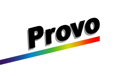
Provo's old flag is iconic. It's a rainbow line with the word "Provo" written above it. Some might call it tacky, or bad flag design, but it is loud and unashamed.
Recently this unique distinctive flag has been replaced by the one below.
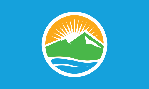
This flag is just some mountains and rivers. It looks generic. It looks like the flag of some suburb without any clear identity.
Provo's old flag was certainly much maligned. It has been compared to Pocatello. Pocatello's flag had the problem of a copyright notice on the flag itself, and the mountains looked like they were written in Crayon.
Provo's old flag, was bold. It also followed most of the principles in good flag bad flag.
- Keep It Simple. The flag should be so simple that a child can draw it from memory.
- Use Meaningful Symbolism. The flag's images, colors, or patterns should relate to what it symbolizes.
- Use 2 or 3 Basic Colors. Limit the number of colors on the flag to three which contrast well and come from the standard color set.
- No Lettering or Seals. Never use writing of any kind or an organization's seal.
- Be Distinctive or Be Related. Avoid duplicating other flags, but use similarities to show connections.
It was simple, and a child can draw it from memory. It's a diagonal rainbow with "Provo" written above it in black. New one? It's way harder to draw. Meaningful symbolism? Uh, idk. The basic colours is like a rainbow is a rainbow, that's a color, and black and white. It achieves this contrast because the rainbow is there, and people can see it and say "ooh a rainbow", so the contrast is effective. The new one though it separates green and blue with fimbriations, doesn't work too well. Blue and green as contrasting colours do not work well.

10
The Issue
Provo's old flag is iconic. It's a rainbow line with the word "Provo" written above it. Some might call it tacky, or bad flag design, but it is loud and unashamed.
Recently this unique distinctive flag has been replaced by the one below.
This flag is just some mountains and rivers. It looks generic. It looks like the flag of some suburb without any clear identity.
Provo's old flag was certainly much maligned. It has been compared to Pocatello. Pocatello's flag had the problem of a copyright notice on the flag itself, and the mountains looked like they were written in Crayon.
Provo's old flag, was bold. It also followed most of the principles in good flag bad flag.
- Keep It Simple. The flag should be so simple that a child can draw it from memory.
- Use Meaningful Symbolism. The flag's images, colors, or patterns should relate to what it symbolizes.
- Use 2 or 3 Basic Colors. Limit the number of colors on the flag to three which contrast well and come from the standard color set.
- No Lettering or Seals. Never use writing of any kind or an organization's seal.
- Be Distinctive or Be Related. Avoid duplicating other flags, but use similarities to show connections.
It was simple, and a child can draw it from memory. It's a diagonal rainbow with "Provo" written above it in black. New one? It's way harder to draw. Meaningful symbolism? Uh, idk. The basic colours is like a rainbow is a rainbow, that's a color, and black and white. It achieves this contrast because the rainbow is there, and people can see it and say "ooh a rainbow", so the contrast is effective. The new one though it separates green and blue with fimbriations, doesn't work too well. Blue and green as contrasting colours do not work well.
The Decision Makers


Petition Updates
Share this petition
Petition created on March 19, 2025