

Not This Logo. Not This Community.
Not This Logo. Not This Community.
The Issue
To the Administration and Board of Trustees of Berklee College of Music,
We, the undersigned — students, faculty, staff, and alumni of Berklee College of Music — write to you with deep concern and heartfelt urgency regarding the proposed replacement of our beloved institutional logo. We are not simply attached to an image. We are attached to what that image means: who we are, where we come from, and what we believe music can do in the world. We ask that you reconsider this change before something irreplaceable is lost.
I. The Music Is Missing
The current Berklee logo carries music in its very bones. The natural sign — that bold, red symbol at the heart of our brand — is not decorative. It is declarative. It announces, without words, that this institution is about music: specifically, about the act of playing freely, of releasing a note from its accidentals, of returning to something pure and true.
Every musician who has ever studied notation understands immediately what that symbol means. It is a mark of belonging — a shorthand that says you are in the right place. The proposed replacement — plain, typographic, stripped of musical reference — communicates nothing about music at all. It could belong to a bank. A consulting firm. An airport. It does not belong to a college that has produced some of the most transformative musical voices of the last half-century.
When a student walks into their first ear training class, opens their first piece of sheet music, or takes the stage for the first time — that natural sign should be on the back of their hoodie, stitched into their bag, printed on their ID. It should remind them why they came here. A wordmark alone cannot do that work.
II. A Community, Not a Corporation
Berklee is not a brand. It is a community. It is the saxophonist practicing at midnight, the producer who hasn’t slept in thirty-six hours, the voice teacher who knows every one of her students by their vibrato. It is the friendships forged in cramped practice rooms and the grief shared when a fellow musician loses their footing. It is messy, passionate, plural, and alive.
The current logo reflects that life. The red of the natural sign is the red of urgency, of emotion, of blood pumping before a performance. It is warm. It is human. It says: something is at stake here.
Alumni across generations recognize that symbol instantly. It is a thread running through decades of shared experience — through every Commencement, every late-night jam session, every triumph and breakdown that this institution has witnessed. To replace it is not merely a rebrand. It is a severance. And communities cannot afford to be severed from their symbols.
III. Identity Is Not Incidental
When institutions change their logos, they send a message — whether they intend to or not. That message, in this case, would be: the past does not matter. The people who built this place do not matter. The specific, musical, irreplaceable character of Berklee does not matter.
We reject that message. Our identity is not incidental to what we do here. It is the foundation of it. Musicians come to Berklee because it is Berklee — with all the weight, history, and specificity that name carries. A featureless logotype strips that specificity away. It leaves behind a name without a face, a title without a story.
Prospective students choosing between institutions do not fall in love with clean typographies. They fall in love with identities. They see our current logo and they understand, instinctively, that Berklee is different — that it is a place where music is not just studied but lived. The proposed logo offers them nothing to fall in love with.
IV. Simplicity Is Not a Virtue Here
We understand the appeal of simplicity. In an era of minimalist design, there is pressure on institutions to flatten themselves into something legible on a phone screen, scalable to any size, inoffensive to any eye. We understand that impulse. We reject it, for this reason:
Berklee is not simple. It has never been simple. It should never be simple.
This institution houses thousands of emotionally complicated human beings. People who chose music — not business, not engineering, not law — because they had something inside them that demanded to be expressed, and could not be simplified away. Our students carry grief and joy and rage and love into practice rooms every single day. They write songs about things that cannot be said in words. They construct harmonies that contain contradictions. They are not simple, and neither is their art.
A logo that aspires to simplicity aspires to represent something Berklee is not. It is a form of institutional dishonesty — a promise that this is an easy place, a smooth place, a place without friction. But music has friction. Growth has friction. The very act of becoming an artist is, in the deepest sense, a refusal to be simple.
Our logo should be as complex as the people who make Berklee what it is. It should carry weight. It should mean something. It should ask something of the person who looks at it. The current logo does all of this. The proposed replacement does none of it.
Our Request
We respectfully and urgently ask the administration and trustees of Berklee College of Music to:
- Halt the implementation of the proposed logo change immediately.
- Convene an open forum with students, faculty, staff, and alumni to discuss the institution’s visual identity.
- Commit to preserving the musical symbolism at the core of our brand in any future design work.
- Recognize that our community’s voice must be part of any decision that affects our shared identity.
Berklee has earned its place in the world not by making itself easier to look at, but by making music impossible to ignore. We ask you to honor that legacy — in sound, and in symbol.
PROPOSED NEW LOGO DESIGN:
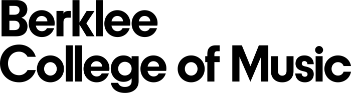
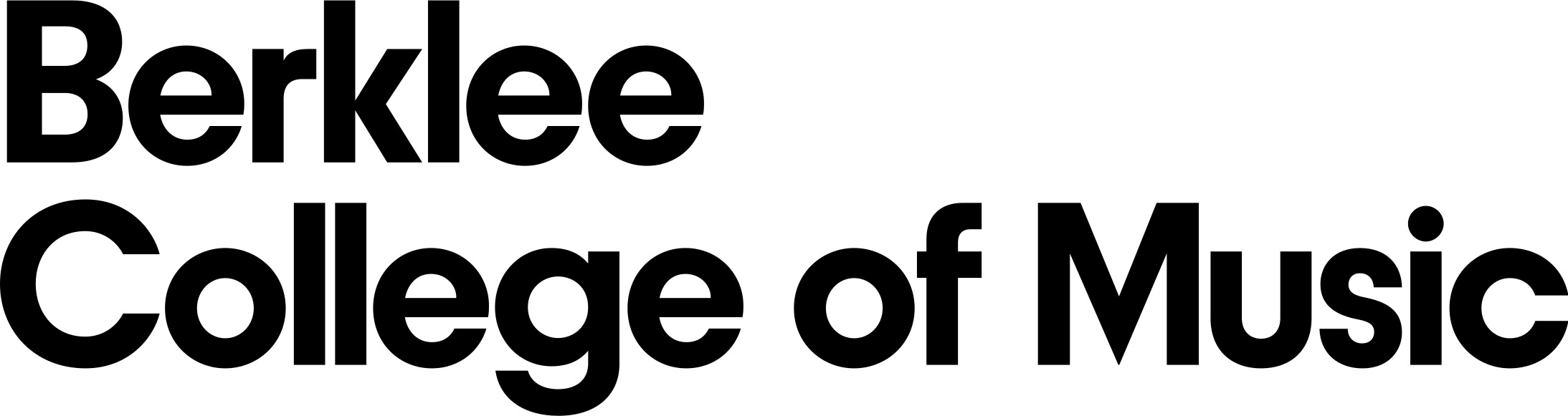
CURRENT LOGO DESIGN:


18
The Issue
To the Administration and Board of Trustees of Berklee College of Music,
We, the undersigned — students, faculty, staff, and alumni of Berklee College of Music — write to you with deep concern and heartfelt urgency regarding the proposed replacement of our beloved institutional logo. We are not simply attached to an image. We are attached to what that image means: who we are, where we come from, and what we believe music can do in the world. We ask that you reconsider this change before something irreplaceable is lost.
I. The Music Is Missing
The current Berklee logo carries music in its very bones. The natural sign — that bold, red symbol at the heart of our brand — is not decorative. It is declarative. It announces, without words, that this institution is about music: specifically, about the act of playing freely, of releasing a note from its accidentals, of returning to something pure and true.
Every musician who has ever studied notation understands immediately what that symbol means. It is a mark of belonging — a shorthand that says you are in the right place. The proposed replacement — plain, typographic, stripped of musical reference — communicates nothing about music at all. It could belong to a bank. A consulting firm. An airport. It does not belong to a college that has produced some of the most transformative musical voices of the last half-century.
When a student walks into their first ear training class, opens their first piece of sheet music, or takes the stage for the first time — that natural sign should be on the back of their hoodie, stitched into their bag, printed on their ID. It should remind them why they came here. A wordmark alone cannot do that work.
II. A Community, Not a Corporation
Berklee is not a brand. It is a community. It is the saxophonist practicing at midnight, the producer who hasn’t slept in thirty-six hours, the voice teacher who knows every one of her students by their vibrato. It is the friendships forged in cramped practice rooms and the grief shared when a fellow musician loses their footing. It is messy, passionate, plural, and alive.
The current logo reflects that life. The red of the natural sign is the red of urgency, of emotion, of blood pumping before a performance. It is warm. It is human. It says: something is at stake here.
Alumni across generations recognize that symbol instantly. It is a thread running through decades of shared experience — through every Commencement, every late-night jam session, every triumph and breakdown that this institution has witnessed. To replace it is not merely a rebrand. It is a severance. And communities cannot afford to be severed from their symbols.
III. Identity Is Not Incidental
When institutions change their logos, they send a message — whether they intend to or not. That message, in this case, would be: the past does not matter. The people who built this place do not matter. The specific, musical, irreplaceable character of Berklee does not matter.
We reject that message. Our identity is not incidental to what we do here. It is the foundation of it. Musicians come to Berklee because it is Berklee — with all the weight, history, and specificity that name carries. A featureless logotype strips that specificity away. It leaves behind a name without a face, a title without a story.
Prospective students choosing between institutions do not fall in love with clean typographies. They fall in love with identities. They see our current logo and they understand, instinctively, that Berklee is different — that it is a place where music is not just studied but lived. The proposed logo offers them nothing to fall in love with.
IV. Simplicity Is Not a Virtue Here
We understand the appeal of simplicity. In an era of minimalist design, there is pressure on institutions to flatten themselves into something legible on a phone screen, scalable to any size, inoffensive to any eye. We understand that impulse. We reject it, for this reason:
Berklee is not simple. It has never been simple. It should never be simple.
This institution houses thousands of emotionally complicated human beings. People who chose music — not business, not engineering, not law — because they had something inside them that demanded to be expressed, and could not be simplified away. Our students carry grief and joy and rage and love into practice rooms every single day. They write songs about things that cannot be said in words. They construct harmonies that contain contradictions. They are not simple, and neither is their art.
A logo that aspires to simplicity aspires to represent something Berklee is not. It is a form of institutional dishonesty — a promise that this is an easy place, a smooth place, a place without friction. But music has friction. Growth has friction. The very act of becoming an artist is, in the deepest sense, a refusal to be simple.
Our logo should be as complex as the people who make Berklee what it is. It should carry weight. It should mean something. It should ask something of the person who looks at it. The current logo does all of this. The proposed replacement does none of it.
Our Request
We respectfully and urgently ask the administration and trustees of Berklee College of Music to:
- Halt the implementation of the proposed logo change immediately.
- Convene an open forum with students, faculty, staff, and alumni to discuss the institution’s visual identity.
- Commit to preserving the musical symbolism at the core of our brand in any future design work.
- Recognize that our community’s voice must be part of any decision that affects our shared identity.
Berklee has earned its place in the world not by making itself easier to look at, but by making music impossible to ignore. We ask you to honor that legacy — in sound, and in symbol.
PROPOSED NEW LOGO DESIGN:
CURRENT LOGO DESIGN:
18
The Decision Makers
Supporter Voices
Petition Updates
Share this petition
Petition created on May 9, 2026