Ban Youtube new UI change

Ban Youtube new UI change
The Issue
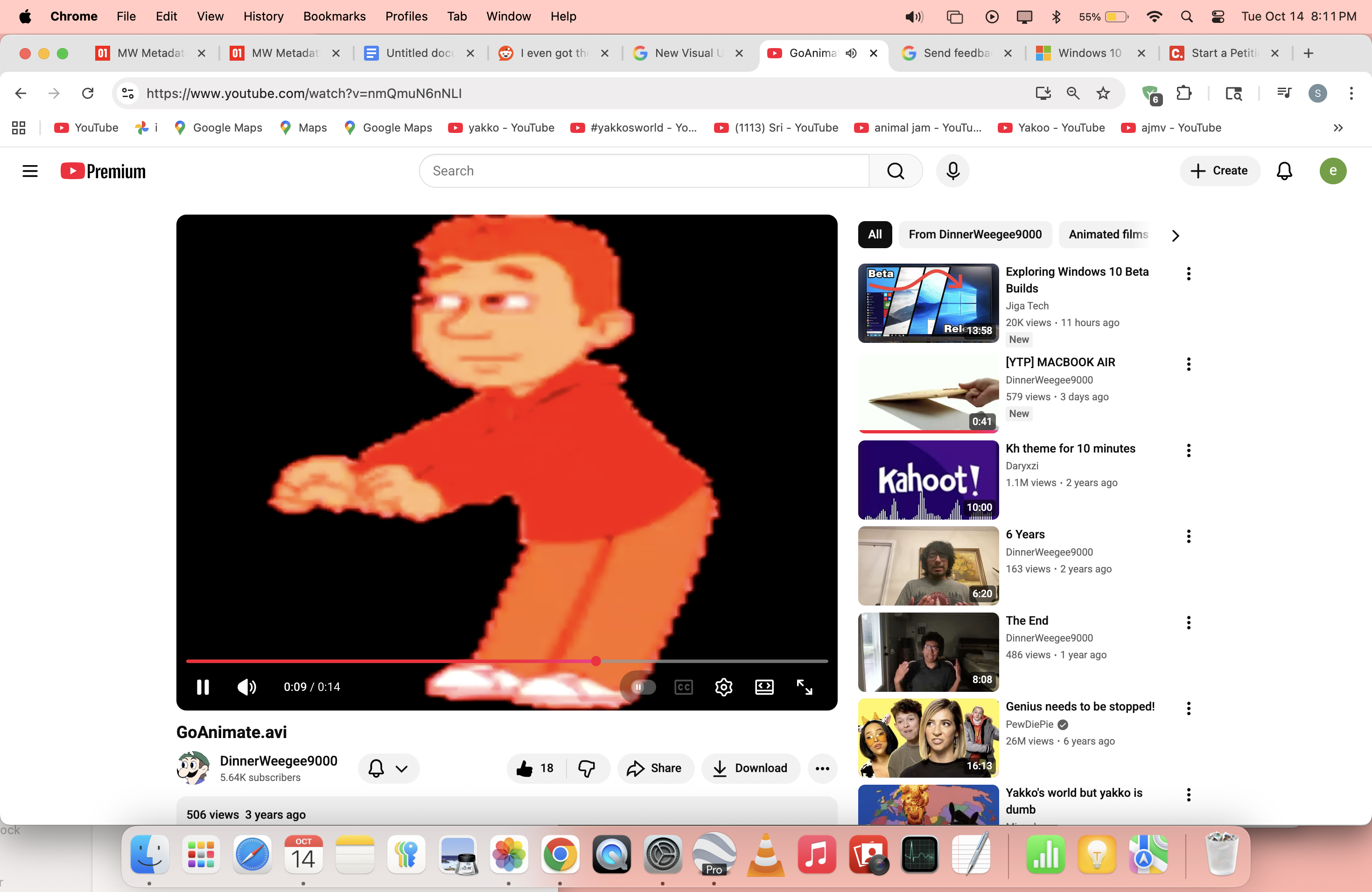
Youtube started rolling out a new UI change for some people and people do not like the new UI change. The buttons are large, annoying and bad. And the new buttons are like a cheap site. Youtube does not care at all. People are finding extensions for this ui change and Youtube will decline in the future because of the UI change
Here are some people's thoughts
Click on these links to view Youtube's perspective and user's perspective on Reddit.
Curiously I don't have the exact same one. Honestly I hated it but finally I don't find it that bad.
My main issues are the play button being too big (I get that it's useful but it's really too big), the texts and numbers that are too small, too big or just not well aligned, the fullscreen and cinema icons that didn't need that change and the like/dislkie and volume buttons that are UGLY
The icons are pretty hard to see. Also you have to aim your click to enter and exit fullscreen. The old UI had a bigger grace period anywhere near the bottom right hand corner.
God, YouTube are always making the most horrible UI updates ever. For what reason would they introduce more clutter around the buttons when it was totally fine before??
Also really really hate the fact that you can no longer scroll your cursor to the bottom right and press to close full screen, now you have to actively put the cursor EXACTLY on the button or it registers as the normal screen and pauses, it all makes it feel so much less intuitive and less smooth.
https://support.google.com/youtube/thread/380540176
https://www.reddit.com/r/youtube/comments/1o6mxjy/i_even_got_the_terrible_new_ui_i_hope_youtube/

55
The Issue
Youtube started rolling out a new UI change for some people and people do not like the new UI change. The buttons are large, annoying and bad. And the new buttons are like a cheap site. Youtube does not care at all. People are finding extensions for this ui change and Youtube will decline in the future because of the UI change
Here are some people's thoughts
Click on these links to view Youtube's perspective and user's perspective on Reddit.
Curiously I don't have the exact same one. Honestly I hated it but finally I don't find it that bad.
My main issues are the play button being too big (I get that it's useful but it's really too big), the texts and numbers that are too small, too big or just not well aligned, the fullscreen and cinema icons that didn't need that change and the like/dislkie and volume buttons that are UGLY
The icons are pretty hard to see. Also you have to aim your click to enter and exit fullscreen. The old UI had a bigger grace period anywhere near the bottom right hand corner.
God, YouTube are always making the most horrible UI updates ever. For what reason would they introduce more clutter around the buttons when it was totally fine before??
Also really really hate the fact that you can no longer scroll your cursor to the bottom right and press to close full screen, now you have to actively put the cursor EXACTLY on the button or it registers as the normal screen and pauses, it all makes it feel so much less intuitive and less smooth.
https://support.google.com/youtube/thread/380540176
https://www.reddit.com/r/youtube/comments/1o6mxjy/i_even_got_the_terrible_new_ui_i_hope_youtube/
55


Supporter Voices
Petition created on October 14, 2025