

FIX FIRE EMBLEM: THREE HOUSES'S TEXT SIZE
The Issue
While presumably easy enough to read by those who have experienced the game two feet away from a large monitor while sitting at a desk (aka the experience of developer and reviewer alike), the microorganism-sized text in Fire Emblem: Three Houses can be a nightmare for anyone who wishes to enjoy the game from the comfort of a more casual setup, such as on the living room TV or even on the Nintendo Switch screen itself.
Insufficient text size in games is an industry-wide problem stemming from studios not thoroughly considering all audiences. Not just in terms of people's various setups (which is ESPECIALLY egregious in this case given the Switch's very nature), but also in terms of the fact that not all players have immaculate eyesight. This issue is emblematic of critical design decisions being made with no insight from outside the office, and I wouldn't say pushing for more readable screens is exactly an infringement of artistic liberty.
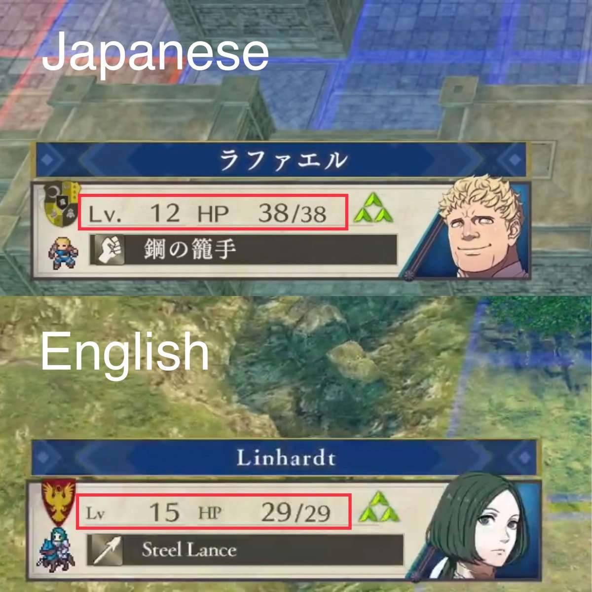
Unlike Xenoblade Chronicles X -- a Nintendo-published title from 2015 that featured problematic user interface design from the very beginning -- the Japanese version of Three Houses appears to at least be relatively serviceable. The same cannot be said for the localized version released in the West, which introduces a smaller, serif font that goes so far as to even reduce the size of words and letters that were already in English. If many of the text visibility issues are unique to the localization, then I would think they should be addressable by the same people.
Let's tell Nintendo of America what they need to hear, guys. (And yes, it would be nice if all language options could be patched to feature a more optimal user interface altogether, but let's stick with a realistic goal for now.)
EDIT (11/8/2026): GREETINGS FROM THE YEAR OF OUR PROGENITOR GOD 2026. While the size of Three Houses's text sadly was never adjusted, there have been two mainline Fire Emblem games in the time since and I'm happy to say that Nintendo seems to have taken fans' criticism to heart. The user interfaces of Fire Emblem Engage and Fire Emblem: Fortune's Weave are both major improvements over that of Three Houses, offering text that is larger and more readable in general. Nintendo also released a Xenoblade Chronicles X: Definitive Edition that sports larger text as part of a greater UI overhaul, making it more in line with the other Xenoblade Chronicles entries on Switch. Hopefully the days of tiny text are behind us!

850
The Issue
While presumably easy enough to read by those who have experienced the game two feet away from a large monitor while sitting at a desk (aka the experience of developer and reviewer alike), the microorganism-sized text in Fire Emblem: Three Houses can be a nightmare for anyone who wishes to enjoy the game from the comfort of a more casual setup, such as on the living room TV or even on the Nintendo Switch screen itself.
Insufficient text size in games is an industry-wide problem stemming from studios not thoroughly considering all audiences. Not just in terms of people's various setups (which is ESPECIALLY egregious in this case given the Switch's very nature), but also in terms of the fact that not all players have immaculate eyesight. This issue is emblematic of critical design decisions being made with no insight from outside the office, and I wouldn't say pushing for more readable screens is exactly an infringement of artistic liberty.
Unlike Xenoblade Chronicles X -- a Nintendo-published title from 2015 that featured problematic user interface design from the very beginning -- the Japanese version of Three Houses appears to at least be relatively serviceable. The same cannot be said for the localized version released in the West, which introduces a smaller, serif font that goes so far as to even reduce the size of words and letters that were already in English. If many of the text visibility issues are unique to the localization, then I would think they should be addressable by the same people.
Let's tell Nintendo of America what they need to hear, guys. (And yes, it would be nice if all language options could be patched to feature a more optimal user interface altogether, but let's stick with a realistic goal for now.)
EDIT (11/8/2026): GREETINGS FROM THE YEAR OF OUR PROGENITOR GOD 2026. While the size of Three Houses's text sadly was never adjusted, there have been two mainline Fire Emblem games in the time since and I'm happy to say that Nintendo seems to have taken fans' criticism to heart. The user interfaces of Fire Emblem Engage and Fire Emblem: Fortune's Weave are both major improvements over that of Three Houses, offering text that is larger and more readable in general. Nintendo also released a Xenoblade Chronicles X: Definitive Edition that sports larger text as part of a greater UI overhaul, making it more in line with the other Xenoblade Chronicles entries on Switch. Hopefully the days of tiny text are behind us!
The Decision Makers

Petition Updates
Share this petition
Petition created on July 25, 2019