
Jul 20, 2017
It's been quiet over here, but I've been putting in some good work. I reached out to President Jessup who is out of town for a couple weeks and he set up a meeting for me with his chief of staff, Chief Marking Officer and VP of Brand Recognition, and VP of Student Affairs.
While I wasn't able to get the logo changed after one meeting I feel like today's meeting was a win for the community. I will not be able to address every issue, but I’d like to hit a few I think many people are concerned about.
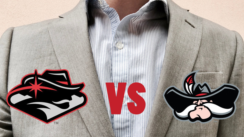
First and foremost, it is not and was not the desire of the administration to diminish the prominence and importance of Hey Reb to the community and the school. The addition of other elements and styles, (mountains, sign, star, abstractionism) were meant to 1) modernize the logo, and 2) bring in native elements to the logo. According to their research, Hey Reb without the “UNLV” above his head did not create a direct tie to Las Vegas or Nevada. As locals we’ve lived with Hey Reb so long and many of us see him as the Batman to our Gotham, but that was not the case for all. The addition of the other elements were meant to create a more personal brand, but this was perceived by many of us as a way to diminish Hey Reb. As a take away from this it is good to know that the intentions of the administration are good, but it doesn’t change that fact that the logo is still too busy, and hard to understand. As a response to this I was told that according to their research the logo became more understandable and likable overtime.
Second, Hey Reb is not going anywhere. The committee I met with was very clear that Hey Reb is not going anywhere. I was not given a picture of the newly updated mascot, but I was assured that it will be more of a wardrobe change than reflection of the new abstract logo. I was told that many will not recognize any changes to Hey Reb at games. The only change I was told was that Hey Reb’s hat will be darker to reflect the dark hat he gained in the 2005 logo, and the one he still sports in the new one. I was told that a suggestion was made to remove the name “Hey Reb” but it was quickly shot down in part because of the publics reaction to the new logo, and the support of this petition.
Third, the logo is separate from the mascot. Many schools incorporate the mascot into their logo like highly regarded University of Texas (very abstractly), and other successful logos choose to simply use a letter like the “O” in Oregon. Universities typically employ several variations of logos for various purposes. At UNLV Hey Reb isn’t represented on the basketball or football uniforms. Instead our jerseys are dawned with the letters UNLV. The most successful logos are very abstract, but also very simple. The new logo embraces one and ignores the other. The positive take aways from this are that we will still see Hey Reb in all his glory at events, and if nothing about the logo changes our teams are likely to keep our standard “UNLV” across the front of the uniforms.
I know this isn’t the update that many were hoping for, but this is a process, and I feel that this was a good start. They were very impressed by the size of the petition, and they asked to receive a copy of my presentation to give feedback to President Jessup and the rest of his committee when they reconvene in August.
Copy link
WhatsApp
Facebook
Nextdoor
Email
X